
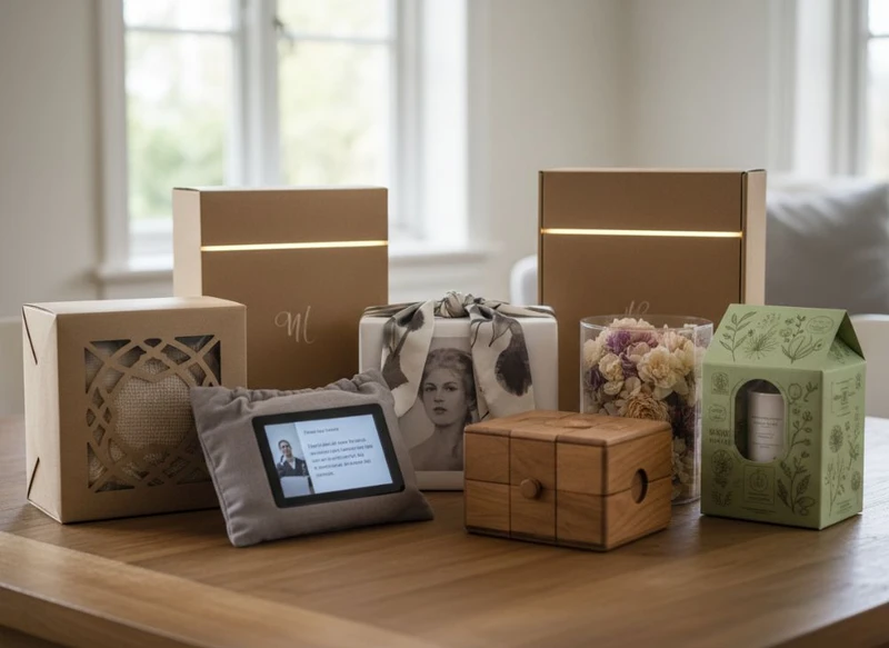
The top 7 gift packaging trends for 2026 point towards packaging that is easier to reuse, simpler to recycle, more inclusive to open and read, and more relevant after the gift has been given. The strongest designs are not necessarily the most elaborate: they use material, structure and digital features deliberately.
For South African brands, retailers and product teams, the practical challenge is to balance shelf appeal, protection, packing efficiency and a credible customer experience. A trend is worth adopting only when it suits the product, sales channel, order volume and disposal or reuse journey.
1. Material reduction and recyclable structures
Reducing unnecessary material is one of the most important gift packaging design directions for 2026. This does not mean every box should look plain or lightweight. It means removing layers, inserts, coatings and mixed materials that do not add enough protection, function or perceived value.
A considered structure can often create a premium unboxing experience without relying on excess plastic film, oversized void space or multiple decorative components. For example, a well-proportioned folding carton with a paper-based insert may replace a larger rigid presentation pack where the product does not require the additional protection.
What material reduction looks like in practice
Common approaches include:
- Selecting a box size that closely fits the product and required protective insert
- Replacing separate filler pieces with a structural paperboard insert
- Reducing unnecessary sleeves, wraps, ribbons and secondary cards
- Using a single dominant material where practical
- Avoiding permanent combinations of materials that are difficult to separate
- Designing printed information directly onto the pack rather than adding multiple loose leaflets
Paper and paperboard formats are often straightforward choices for brands seeking a more familiar recycling route. However, recyclability is not a universal property. It can be affected by coatings, lamination, adhesives, metallic finishes, ink coverage, product contamination and the collection options available to the end user.
Before making a recycling claim, confirm the full construction of the pack and assess whether the claim is appropriate for the intended market. Terms such as “recyclable”, “plastic-free” and “compostable” should be used only where the specific material and disposal conditions support them.
Design trade-off: protection versus reduction
Material reduction should never compromise product safety. Fragile glass, ceramics, cosmetics, electronics and premium food items may still need robust protection. The goal is to identify where structure can do the work of extra components.
Ask these questions during development:
- What damage risks must the packaging manage?
- Does every component protect, inform or improve the gift experience?
- Can an insert be redesigned to use less material while holding the item securely?
- Can the customer easily separate components after opening?
- Is the final pack appropriately sized for storage, display and dispatch?
2. Reusable and keepsake formats
Gift packaging is increasingly designed to remain useful after the original product is removed. Keepsake boxes, reusable tins, drawer-style packs and durable rigid boxes can extend the life of the packaging and make the gift feel more substantial.
This trend is especially relevant when the packaging has a clear secondary purpose. A tea box can become a sachet organiser; a gift set box can store photographs, stationery or small personal items; a sturdy apparel box can be reused for wardrobe organisation. Reuse is more credible when the format is genuinely practical rather than merely attractive.
When reusable packaging adds value
Reusable formats can suit:
- Seasonal gifting ranges
- Premium product bundles
- Beauty, fragrance and wellness sets
- Jewellery and accessories
- Corporate and event gifting
- Limited-edition products
- Products purchased for milestones or celebrations
A reusable pack generally needs enough durability to withstand repeat handling. This may involve stronger board, reinforced corners, a well-fitted lid or a closure that continues to function after repeated opening. These choices can add material and cost, so reuse should be intentional rather than assumed.
Avoid the “keepsake” trap
Not every gift needs a rigid box. An unnecessarily heavy or elaborate pack can increase storage requirements and use more resources without creating lasting value. A useful decision test is simple: would the recipient realistically keep and use this package if the branding were less prominent?
If the answer is no, a lighter recyclable structure may be the more appropriate option.
3. Tactile papers and restrained finishes
In 2026, premium gift packaging is likely to rely less on visual clutter and more on physical texture, strong typography and controlled finishing. Tactile paper stocks, embossed details, debossed marks, subtle foil accents and well-chosen uncoated surfaces can create a considered impression without overwhelming the design.
This approach is particularly useful for brands that want the packaging to feel premium but still communicate calmness, craft or authenticity. Rather than covering every surface with decoration, the design gives selected details room to stand out.
Finishes that support a focused design
Depending on the product and pack structure, consider:
- Textured or lightly grainy paper stocks
- Blind embossing or debossing
- A single foil detail used sparingly
- Spot varnish only where it supports hierarchy
- Natural or muted colour palettes
- Visible paper fibres or understated board edges
- Simple closures such as a tab, sleeve or paper seal
The choice of finish affects more than appearance. It can influence scuff resistance, print consistency, assembly requirements and end-of-life separation. Highly layered finishes may also complicate recycling assessment. Discuss the intended use of the box before selecting decorative processes, especially if it will travel through e-commerce fulfilment or be handled frequently in retail.
Make tactile design work for the product
Texture should reinforce the brand and category. A luxurious fragrance set may suit a soft-touch feel or deep embossing, while a handmade food gift might benefit from warm, natural paper textures. A finish should not make important product information difficult to read or reduce the package’s ability to withstand normal handling.
The most effective restrained designs establish a hierarchy:
- Brand or collection name
- Product name and key variant
- Essential product information
- Supporting decorative elements
This order keeps the packaging attractive while helping customers identify the product quickly.
4. Modular inserts and adaptable formats
Gift sets are becoming more flexible, and packaging needs to accommodate this without requiring a completely new box for every product combination. Modular formats use adaptable inserts, dividers, sleeves or internal trays to hold different sizes or quantities within a consistent outer structure.
For buyers, this can simplify range planning. A shared carton footprint may support several variations, while inserts are adjusted for the contents. It can also help retailers present a cohesive collection across different price points or product bundles.
Benefits of modular gift packaging
A modular system can help a brand:
- Build gift sets from changing product combinations
- Introduce seasonal bundles with less structural redesign
- Use a common outer carton across related products
- Improve product positioning inside the box
- Create tiered gift options through insert and sleeve changes
- Reduce the need to hold many unrelated packaging formats
For example, one outer gift box could accommodate a single hero product, a two-item set or a mixed selection through different inserts. The outer pack may remain consistent while printed sleeves or labels distinguish the contents.
Compatibility checks before committing
Modularity requires careful specification. A flexible insert should not allow products to shift, collide or appear untidy. Confirm:
- Product dimensions, weight and shape tolerances
- Whether products are round, irregular or fragile
- How easily staff can assemble the pack
- Whether the insert remains stable during handling
- How much variation the outer box can accommodate
- Whether the same format works for retail display and online orders
- If labels, barcodes and product details vary by set
A design that works with a sample product may fail when the actual assortment changes. Build tolerance into the specification and review every intended combination before production.
5. Personalisation without excessive complexity
Personalisation remains valuable in gift packaging, but the 2026 direction is towards selective, scalable customisation rather than a fully bespoke pack for every recipient. Customers may appreciate a name, short message, event date, colour option or tailored sleeve, yet these additions should not create unnecessary packing errors or operational strain.
The best personalisation strategies separate the permanent packaging elements from the variable ones. The main box can remain consistent while a label, card, belly band, printed sleeve or digital message provides the customised detail.
Practical ways to personalise gift packs
Options include:
- Name labels or message stickers
- Variable printed gift cards
- Event-specific sleeves
- Colour-coded packaging for product choices
- Short-run seasonal outer wraps
- A dedicated space for a handwritten note
- QR codes that lead to recipient-specific content where appropriate
This model allows a brand to preserve a polished core package while adapting it for birthdays, festive gifting, weddings, corporate occasions or product launches.
Keep complexity under control
Personalisation can create mistakes when names, product variants, labels and pack contents are managed separately. Limit the number of variable elements and create a clear approval process for artwork and data.
Before choosing a personalised format, establish:
- Which elements remain fixed across all orders
- Which elements change for each campaign or recipient
- Who checks spelling, artwork and variable data
- How packs will be sorted and assembled
- What happens if a component is missing or incorrect
- Whether personal data is handled appropriately for the intended use
A simple system that is consistently accurate is usually more valuable than a highly customised concept that is difficult to fulfil.
6. Accessible and legible presentation
Gift packaging should be enjoyable to open and easy to understand. Accessible design in 2026 includes legible type, useful contrast, clear product identification and packaging structures that do not require excessive force or guesswork to open.
This matters across gift categories. A recipient should be able to identify the product, find key information and remove the item without damaging the box or struggling with hidden closures.
Design choices that improve usability
Useful accessibility considerations include:
- Clear contrast between text and background
- Readable font sizes for essential information
- Straightforward opening points, tabs or pull features
- Clear visual signals for where to open the pack
- Limited use of low-contrast text over busy artwork
- Logical information order across the front, sides and back
- Differentiation between similar variants through more than colour alone
Where tactile embellishments are used, they can help guide interaction, such as an embossed opening mark or a textured pull tab. They should not replace clear written instructions where instructions are needed.
Common legibility mistakes
Premium design can sometimes undermine practical communication. Avoid:
- Very small ingredient, product or usage text
- Light text on light backgrounds
- Shiny finishes that make essential text hard to read
- Decorative typefaces for key information
- Closures that are attractive but unclear
- Packaging that must be torn to access the product when reuse is intended
Requirements for product labelling vary by category, so brand owners should verify the current rules and any relevant standards for their product before finalising artwork. Build mandatory information into the layout from the start rather than trying to fit it in after visual design approval.
7. Digital touchpoints used with purpose
QR codes, NFC-enabled components and short digital prompts can extend the gift experience beyond the physical box. In 2026, the strongest digital touchpoints will be useful, optional and clearly connected to the product or recipient.
A QR code may lead to gifting instructions, product care, an authenticity or registration process, a recipe, a playlist, a how-to video or an event message. It can help reduce the need for a large printed insert, but it should not hide critical information that the customer needs before or immediately after opening.
Use digital features to solve a clear need
A digital touchpoint works best when it answers a natural customer question, such as:
- How do I use or care for this item?
- What is included in the set?
- Is there a gift message from the sender?
- How can I reorder or explore related products?
- What should I do with the packaging after use?
- How can I access fuller product instructions?
The physical packaging should explain what the code provides. A bare QR code with no context gives customers little reason to scan it.
Limitations to plan for
Digital elements require maintenance. A QR code that leads to removed content, a slow page or an irrelevant generic homepage can weaken the experience. Confirm who will own the destination page, how long it will remain live and whether the information is easy to use on a mobile device.
Do not rely on a QR code as the only place for essential safety, legal or product-identification information. Customers may not have connectivity, a compatible device or the inclination to scan.
How to assess a trend before production
Packaging trends should inform decisions, not dictate them. Before adopting one of the top 7 gift packaging trends for 2026, assess it against the actual job the pack needs to do.
Use the following framework to compare options.
| Assessment area | Questions to ask | Warning sign |
|---|---|---|
| Product protection | Does the packaging secure the product through storage, handling and delivery? | A reduced-material concept allows movement or damage. |
| Customer experience | Is it attractive, intuitive to open and suitable for gifting? | The pack looks impressive but frustrates the recipient. |
| Reuse or disposal | Can customers realistically reuse, separate or dispose of the components as intended? | Sustainability language is broader than the construction supports. |
| Production practicality | Can the format be printed, assembled and packed consistently? | Too many manual steps or variable parts create errors. |
| Range flexibility | Will it work for future variants, bundles or seasonal changes? | A single-product format locks the brand into frequent redesigns. |
| Information clarity | Are essential product details easy to find and read? | Decoration or finishes obscure important content. |
| Commercial fit | Is the packaging investment appropriate for the product value and order volume? | The pack adds cost without improving protection or customer value. |
A practical approval checklist
Before approving final artwork and structure, review a physical sample with the actual product and check:
- Fit, stability and opening experience
- Print hierarchy and legibility under normal lighting
- Closure performance after repeated opening, if reuse is claimed
- Insert assembly and product loading steps
- Separation of materials where applicable
- Space for required product information, labels and barcodes
- Suitability for retail display, gifting and e-commerce handling where relevant
- Consistency across all planned product variants
It is also sensible to document the packaging specification clearly. Include the board or material type, dimensions, print areas, finishes, insert configuration, closure method and packing sequence. This reduces ambiguity when the range grows or production is repeated.
Choosing the right trend for your product
Not every 2026 gift packaging trend needs to appear in one box. In fact, combining too many ideas can make a pack costly, confusing or difficult to recycle. Most successful projects select one primary priority and one supporting feature.
For example:
- A value-focused gift set may prioritise material reduction and a clean, legible layout.
- A premium limited-edition item may use a reusable rigid box with one refined tactile detail.
- An e-commerce gift bundle may benefit most from modular inserts and a purposeful QR code for care information.
- A corporate gifting range may rely on a standard box with personalised sleeves or cards.
Start with the product, recipient and fulfilment process, then choose the trend that improves those fundamentals.
If you are comparing formats for a new range, review custom packaging boxes for structural options or explore gift packaging solutions when planning presentation-led packs. XGolden Print can also support brands that need custom printed packaging specifications aligned with their product and design requirements.
