
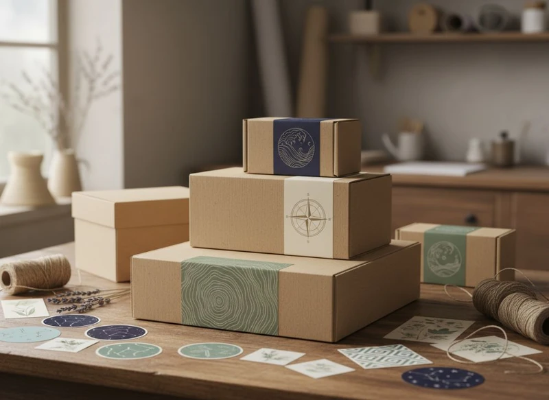
Your packaging tells part of your brand story before a customer opens the product. A custom paper box sets the scene through shape, colour, texture and information hierarchy; a label sticker adds detail, flexibility and a more personal point of contact. Used together, they can make a product feel recognisable, purposeful and easier to trust.
A strong brand story: custom boxes & stickers narrative is not a slogan printed on a carton. It is a consistent system: the packaging looks, feels and speaks like the same business at every touchpoint, from an online order to a retail shelf or a gift-ready presentation.
Packaging touchpoints in a coherent brand narrative
Brand storytelling through packaging starts with deciding what a customer should understand at each point of interaction. The outer box, product label, insert and tamper seal do not need to repeat the same message. Each can do a different job while still belonging to one visual system.
For example, a box may communicate the product category, brand name and value position at first glance. A label sticker can identify a flavour, fragrance, variant, size or batch. Inside the pack, a short message can explain product use, care or the thinking behind the range.
Think of the journey in layers:
- First impression: What does the customer notice from a distance or in a product listing image?
- Recognition: Can they identify the brand quickly among competing products?
- Understanding: Does the pack make the product, variant and key details clear?
- Reassurance: Does the information layout look organised, legible and appropriate to the product?
- Opening experience: Does the unboxing moment reinforce the expected quality and character of the brand?
- Recall and reuse: Is there a distinctive element customers are likely to remember, keep or share?
A premium gifting brand might use restrained colour, tactile stock and carefully placed foil details to create a considered feel. A practical household range may instead need bold labelling, simple instructions and colour coding that speeds up product selection. Neither approach is inherently better. The right narrative is the one that matches the product, target customer and buying context.
Avoid treating packaging as a final decorative step. If the logo, brand voice, product claims and pack structure are developed separately, the result can feel fragmented. Build the story from one short positioning statement, such as “straightforward daily essentials” or “considered gifts for meaningful occasions”, then test every packaging decision against it.
Structure, print and labels as storytelling tools
Packaging structure, print design and labels each influence how people interpret a product. They should be specified as connected choices rather than separate procurement items.
Let the box structure set the expectation
The physical form of a box conveys useful cues before any printed words are read.
- Folding cartons can suit lighter retail products and work well where clear front-facing branding is important.
- Rigid boxes can support a more substantial presentation for selected gift, beauty or premium product applications.
- Mailer-style boxes can combine product protection with a branded delivery and unboxing experience.
- Sleeves can add branding to an existing box format or create a cleaner, less permanent look.
- Windowed cartons can show the product while keeping key brand information on the outer pack.
- Paper bags and smaller accessory boxes can extend the same identity around point-of-sale and gifting moments.
The opening sequence matters too. A lift-off lid suggests ceremony, while a tuck-end carton is more direct and functional. Choose a format based on product protection, filling process, shelf use, storage and customer experience—not appearance alone.
Explore suitable custom paper box options once you have a clear view of the product dimensions, weight, packing method and intended sales channel.
Use print hierarchy before visual decoration
A memorable package does not need to display every piece of brand information at the same size. Establish a reading order so the customer can find what matters quickly.
A practical front panel often prioritises:
- Brand name or logo
- Product name
- Variant, flavour, scent or key differentiator
- Product size or quantity where relevant
- A restrained supporting message or design element
The side and back panels can carry instructions, ingredients, care information, contact details, barcode space and other information appropriate to the product. Requirements can vary by product type and route to market, so check the applicable South African labelling, consumer-information and retailer requirements before approving artwork.
Use typography that remains readable at the actual print size. Fine type, low-contrast text and overly elaborate scripts can look attractive on a screen but become difficult to read on a small label or textured surface.
Give label stickers a defined role
Label stickers are particularly useful where product information varies but the core packaging remains the same. They can distinguish product variants, identify limited runs, add seals or provide practical details without needing a completely different printed box for every SKU.
Common uses include:
- Product and variant labels
- Jar, bottle, pouch and container labels
- Closure seals or tamper-evident labels
- Instruction or care labels
- Promotional overlays for seasonal ranges
- Small branded stickers for tissue paper, inserts or order packing
- Stock-management and product-identification labels
A sticker should look intentionally integrated, not like a late addition. Carry across selected brand elements such as typeface, colour family, icon style, border treatment or tone of voice. At the same time, do not force a label to carry excessive copy simply because space is available.
For a consistent sticker system, review custom label and sticker formats alongside the box artwork, rather than designing them independently.
Consistency across ranges and sales channels
Consistency does not mean every product must use identical packaging. It means people can tell that related products come from the same brand, even when formats, sizes and categories differ.
Create a simple packaging architecture that defines what remains fixed and what can change.
| Element | Keep consistent | Allow to vary |
|---|---|---|
| Brand mark | Position, clear space and primary use | Size where pack dimensions require it |
| Typography | Core typefaces and hierarchy | Text length and layout adjustments |
| Colour | Main brand palette or recognition cue | Variant colours and seasonal accents |
| Product naming | Naming pattern and tone | Specific product or range name |
| Graphic device | Illustration style, pattern or icon system | Product-specific artwork |
| Label layout | Key information order | Product facts and variant identifiers |
| Finish | Overall level of restraint or premium detail | Selected features for special editions |
This is especially important when products are sold through more than one channel. A retail pack may need quick shelf recognition, while e-commerce packaging needs to arrive as a coherent experience after the customer has already made a purchase online. Gift packaging may need to feel more special, whereas a refill or repeat-purchase pack may benefit from clearer practical information.
Check packaging in the contexts where it will actually be seen:
- Against a busy retail shelf or product display
- In an online thumbnail and product-page image
- In a customer’s hand at normal reading distance
- Next to other products in the same range
- Under typical indoor lighting
- As a packed order, including protective materials and any outer box
Do not rely only on a large digital artwork file. A design can look balanced on a monitor yet lose impact when printed at small scale or viewed among many competing packs.
Material and finish choices that support positioning
Materials and finishes should reinforce the brand promise while remaining practical for the product and supply chain. A finish that feels suitable for a luxury gift might be unnecessary for a high-turnover everyday product. Conversely, an uncoated, natural-feeling stock can communicate craft, simplicity or an environmentally minded approach when used with clear intent.
Match the material to the product environment
Consider the real conditions the packaging will face:
- Product weight and shape
- Moisture, oil, dust or handling exposure
- Refrigerated, warm or outdoor conditions where relevant
- Storage duration
- Repeated opening and closing
- Friction between packs during transport
- Whether labels are applied by hand or machine
- Whether the pack will be recycled, reused or discarded after opening
Paperboard thickness, corrugation, label adhesive and protective coatings are technical choices with practical consequences. Confirm suitability with the supplier using actual product details rather than selecting solely from a swatch book.
If a business wants to make environmental claims, wording needs particular care. Terms such as “recyclable”, “compostable” or “plastic-free” may depend on the full material combination, local collection systems, adhesives, coatings and customer disposal conditions. Verify the claim for the final specification before printing it.
Select finishes for meaning, not decoration
Finishes can direct attention and add tactility, but too many competing effects may weaken the story.
| Finish or treatment | Storytelling effect | Consider before choosing |
|---|---|---|
| Matte finish | Understated, modern, soft visual effect | Can show marks depending on the surface and handling |
| Gloss finish | Bright colour and higher visual contrast | May not suit a muted or natural brand direction |
| Spot gloss detail | Draws attention to logos or selected graphics | Needs enough contrast to be noticeable |
| Foil detail | Adds a reflective accent and gift-like feel | Use selectively to avoid a cluttered appearance |
| Embossing or debossing | Creates a tactile logo or pattern | Fine details may not reproduce clearly on all materials |
| Uncoated paper | Natural, crafted or editorial character | Ink appearance and scuff resistance can differ from coated stocks |
| Soft-touch coating | Smooth, tactile premium impression | Confirm practical durability for the intended handling |
Ask to see representative physical samples where possible. Screen colours are not a reliable substitute for printed material, especially with uncoated papers, dark shades, metallic effects or large solid colour areas.
Practical artwork and production planning
Good storytelling depends on production-ready artwork. A clear creative brief and a disciplined approval process reduce avoidable revisions and help retain design intent from concept through to the finished pack.
Start with a packaging brief
Before artwork begins, document the information that affects both design and manufacturing:
- Product dimensions, weight and shape
- Required internal clearance and protection
- Box style and opening direction
- Number of product variants
- Pack quantities and range sizes
- Required information and barcode placement
- Intended print areas and finishes
- Where labels will be applied
- Expected storage, handling and sales conditions
- Target launch timing and approval milestones
- Whether future range extensions are likely
This brief gives designers, product teams and procurement staff a shared basis for decisions. It also prevents a common problem: approving a visually strong concept that is incompatible with product packing, label application or information requirements.
Build the artwork around the dieline
A dieline shows the cut, fold, bleed and safe areas for a box. It is not merely a template to decorate. Panels can become hidden folds, glue areas or underside surfaces, so important text and graphics need to be positioned correctly.
Before final approval, check:
- Bleed has been included where artwork reaches the edge.
- Text, barcodes and critical graphics sit inside safe margins.
- Fold lines do not interrupt type or key design details.
- Images have appropriate resolution for print.
- Fonts are correctly supplied or converted according to the artwork workflow.
- Brand colours are specified consistently.
- Variable text fields are correct for every SKU.
- Barcode size, contrast and quiet zones are suitable for scanning.
- Label dimensions match the application area and container shape.
- Any legal or category-specific pack information has been reviewed by the responsible team.
A mock-up is useful for visual review, but it may not reveal every production issue. Where the stakes are high, consider reviewing a physical proof or sample approach appropriate to the project before approving a full run. Confirm what type of proof is available and what it can realistically demonstrate.
Common narrative and design mistakes
Packaging can fail to tell a clear story when a business tries to solve too many problems on one panel. The following mistakes are common and usually avoidable.
Treating every surface as advertising space
Crowded packs make it harder for customers to identify the product. Give the front panel one primary job, then distribute supporting information across the remaining surfaces in a logical sequence.
Making the logo the only brand asset
A logo alone does not create strong recognition across a large product range. Develop supporting assets: colour rules, typographic hierarchy, image style, patterns, icons, illustration approach or a distinctive layout principle.
Using a different style for every variant
Variant differentiation is useful, but uncontrolled colour, type and graphic changes can make related products look unrelated. Define controlled variation rather than starting each SKU from scratch.
Ignoring label curvature and application conditions
A rectangular label may wrinkle on a curved jar, cross a seam or sit unevenly on a tapered container. Confirm the available label area, curvature, surface texture and application method early.
Choosing materials from appearance alone
A paper stock, coating or adhesive may look right but be unsuitable for friction, moisture, product contact or the product’s storage conditions. Compatibility must be evaluated for the actual application.
Adding unsupported claims
Words such as “natural”, “eco-friendly”, “premium”, “handmade” or performance-related claims can create expectations that the product and packaging need to substantiate. Make sure claims are accurate, appropriately qualified and reviewed by the responsible business team.
Forgetting the operational story
Packaging also needs to work for people packing orders, receiving stock, merchandising products and handling returns. A beautiful box that is slow to assemble, difficult to label or prone to damage may create unnecessary cost and inconsistency.
Scaling the system across product lines
A scalable packaging system lets a brand launch new products without redesigning its identity every time. The goal is not rigid repetition; it is a clear framework that accommodates growth.
Start by defining three levels of packaging elements:
- Core elements: Brand mark, core typefaces, primary palette and main layout rules.
- Range elements: Category colour, shared illustration approach, collection name or repeatable pattern.
- SKU elements: Product name, flavour, scent, size, ingredients, instructions and product-specific image.
This model enables quick recognition while keeping product selection clear. For instance, all products may use the same logo position and typography, each category may use a separate colour family, and every variant may have a unique descriptive name and information panel.
Keep a controlled set of master files, approved colour references, dielines, copy blocks and label templates. Record the reason for key decisions, such as why a particular finish is reserved for gift packs or why a barcode always sits on a certain panel. This protects consistency when internal teams, agencies or suppliers change.
When scaling, review the system at range level rather than only approving one SKU at a time. Lay out representative packs together: a best-seller, a smaller format, a larger format, a new variant and a gift or promotional pack. If they do not feel related in that view, the system may need clearer rules.
Questions to resolve with a packaging supplier
A packaging supplier can provide more useful guidance when the brief covers both creative intent and technical requirements. Ask focused questions before committing to artwork or production.
About the structure and materials
- Which box styles suit the product dimensions, weight and opening experience?
- What internal clearance or insert solution may be needed?
- Which material options are suitable for the intended storage and handling conditions?
- How will the chosen material affect print colour, durability and finish appearance?
- Are there practical limits for windows, cut-outs, fine details or large solid colour areas?
- Which label materials and adhesives suit the container surface and environment?
About printing and artwork
- What artwork format, dieline and colour specification should be used?
- What bleed, safe area and barcode guidance applies to the selected format?
- Which finishes are compatible with the chosen stock and box construction?
- Can physical samples, prototypes or proofs be reviewed, and what will each show?
- How should variable information be supplied across multiple SKUs?
- What tolerance should be allowed for label placement, folds and registration?
About commercial planning
- What are the minimum order considerations for each box or label version?
- How do the number of colours, finishes, sizes and variants affect the production approach?
- Can common structures be used across several products while changing printed artwork?
- How should artwork changes and repeat orders be managed?
- What information is needed to quote accurately and avoid later specification changes?
A clear answer to these questions helps procurement teams compare proposals on more than headline cost. The best choice should support the required product protection, visual consistency, application process and future range plans.
A practical next step is to map your current packaging touchpoints, identify the elements that should stay consistent, and list the information that changes by product. Use that list to develop a concise brief for custom boxes and labels before finalising artwork.
