Subscription packaging concepts built for repeat shipments and stronger brand memory
Subscription box packaging succeeds when it balances consistency, surprise, protection, and packing speed. In South Africa, brands shipping from Johannesburg, Cape Town, Durban, Pretoria, and Gqeberha need packaging that can handle repeat dispatches, changing product mixes, courier pressure, and seasonal campaigns without losing shelf appeal or brand identity. A well-designed subscription box is not only a container; it is part of the product experience, a retention tool, and a practical fulfilment system that reduces errors across monthly runs.
For brands managing rotating assortments, the smartest approach is usually a repeatable outer box format paired with flexible inserts, printed storytelling, and adaptable label or sticker systems. This allows marketing teams to change monthly themes without redesigning the full structure every cycle. It also helps operations teams maintain pick-and-pack efficiency during larger dispatch windows, especially where e-commerce fulfilment overlaps with retail promotions and influencer mailers. Businesses looking for scalable formats often start by comparing options in custom box solutions before deciding how much structure and branding they need for long-term subscription growth.
The South African market has become more sophisticated in how it evaluates packaging. Customers now notice whether a box feels intentional, durable, and shareable, or generic and disposable. They also compare packaging against category expectations: beauty subscribers expect order and protection, snack buyers expect freshness and abundance, hobby audiences expect compartmentalisation, and wellness buyers often look for calm visual presentation and eco-aware materials. The most effective subscription packaging strategy therefore combines logistics logic with sensory design, tailored to the category and the local fulfilment environment.
Planning a repeatable box format for rotating products and monthly campaigns
A repeatable box format gives subscription brands a reliable base for changing product combinations without starting from scratch every month. The outer dimensions, board grade, closure style, and print zones remain stable, while inserts, tissue, cards, stickers, and seasonal sleeves can change by campaign. This approach is especially valuable in South Africa where courier pricing tiers, warehousing layouts, and batch production lead times can influence packaging decisions as much as aesthetics.
The first decision is box footprint. A box that is too large wastes void fill, increases shipping costs, and makes small monthly assortments feel underwhelming. A box that is too tight becomes difficult to pack when product size shifts between campaigns. For rotating assortments, brands often do best with a medium standard mailer or rigid-folding carton that accommodates 70% to 80% of planned monthly selections, then uses inserts or pads to adapt remaining space. This is often more economical than changing structural tooling for every edition.
Campaign planning also matters. If a subscription brand runs Mother’s Day, Heritage Month, spring refresh, festive gifting, or back-to-school themes, the box should include predictable areas for flexible branding. These can include inside-lid print, card slots, colour-changing stickers, short-run sleeves, or a standard outer shell combined with interchangeable top labels. This protects brand recognition while still allowing monthly freshness. It is also helpful for brands distributing nationally from Gauteng into KwaZulu-Natal, the Western Cape, and the Eastern Cape, where inventory simplicity supports faster rollouts.
| Planning factor | Why it matters | Best practice | Risk if ignored | Suitable categories | South Africa note |
|---|---|---|---|---|---|
| Outer box size | Controls courier cost and perceived value | Choose one core size for most monthly runs | Overpaying for shipping or awkward presentation | Beauty, snacks, wellness | Useful where national courier zones affect rates |
| Board strength | Protects products during repeat transit | Match flute or paperboard grade to product weight | Crushed corners and damaged contents | Hobby, food, beauty | Important for long-distance distribution from Gauteng hubs |
| Closure style | Affects unboxing feel and pack speed | Use mailer flaps or magnetic upgrades selectively | Slow assembly or weak sealing | Premium wellness, beauty | Fast pack lines prefer simple tuck or self-locking styles |
| Branding zones | Enables monthly themes without full redesign | Reserve areas for sleeves, cards, and stickers | High redesign costs each cycle | All categories | Supports shorter local campaign lead times |
| Insert compatibility | Allows assortment changes | Design for modular insert swaps | Loose products and presentation inconsistency | Beauty, hobby, wellness | Helpful when product sourcing changes |
| Storage efficiency | Affects warehouse footprint | Use flat-pack structures where possible | Excess storage cost and slower handling | All categories | Relevant for urban warehouse space in Cape Town and Johannesburg |
The table shows why repeatability is not only a design concern but a cost and service issue. Subscription businesses that plan their format early can forecast material usage better, place more efficient print runs, and reduce monthly firefighting when product combinations change unexpectedly.
The growth trend reflects how repeat commerce, curated gifting, and direct-to-consumer fulfilment have expanded demand for structured packaging programmes. By 2026, brands are expected to place greater emphasis on material traceability, pack line automation compatibility, and adaptable branded elements rather than one-off novelty structures.
Insert strategies that keep mixed assortments organized and visually appealing
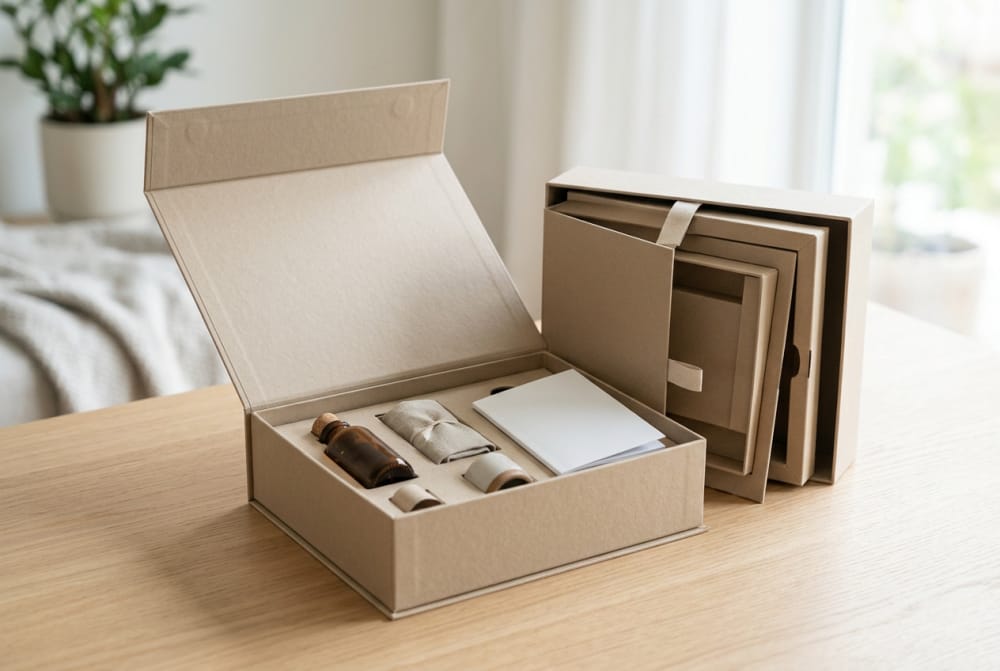
Inserts solve one of the biggest subscription challenges: how to hold different products securely while still looking elegant when the customer opens the box. Mixed assortments can include jars, sachets, pouches, bottles, bars, cards, paper goods, tools, or trial packs. Without insert logic, products collide in transit, labels scuff, and the final presentation feels random. Good insert design creates order immediately, guiding the eye and reinforcing the value of the curation.
There is no single insert solution for every subscription model. Die-cut paperboard inserts work well for beauty bottles, droppers, and wellness vials. Corrugated partitions help with snacks in pouches or jars. Folded card cradles are useful when a monthly assortment changes slightly but still needs basic separation. For hobby kits, layered inserts can sequence the experience by placing tools on top and materials below. The insert should fit the product family, not just the current month’s exact SKU list.
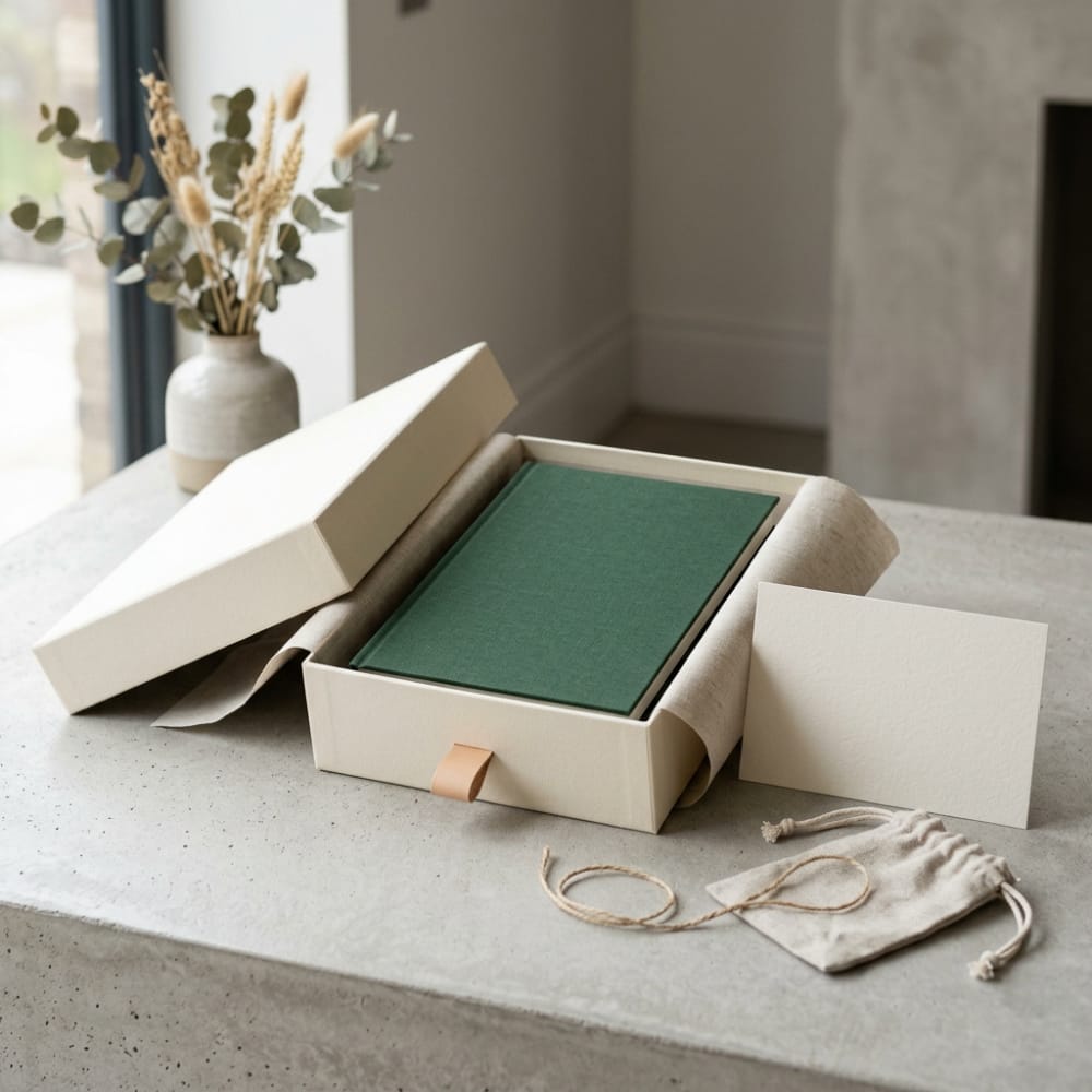
Visual appeal matters just as much as protection. A carefully planned insert creates clean spacing, gives each item a “place,” and reduces the visual noise that can make a premium box feel cheap. Negative space can be useful; a box does not need to be packed edge-to-edge if the arrangement feels deliberate. Tissue, belly bands, recipe cards, ritual guides, or category labels can further clarify the layout. Brands exploring premium presentation often compare structural and decorative options in gift packaging formats that can be adapted for subscription use.
| Insert type | Primary use | Visual effect | Operational benefit | Limitation | Best fit |
|---|---|---|---|---|---|
| Die-cut paperboard insert | Holds bottles, jars, tubes | Neat and premium | Fast placement of standard items | Needs accurate sizing | Beauty and wellness |
| Corrugated divider | Separates heavier products | Structured and practical | Good transit protection | Less luxurious look | Snacks and mixed food boxes |
| Folded cradle insert | Supports changing SKU shapes | Clean and flexible | Easy to assemble | Lower retention for very small items | General subscription assortments |
| Pulp insert | Cradles fragile items | Eco-oriented appearance | Shock absorption | Less sharp print finish | Eco beauty and wellness |
| Layered tray insert | Creates stages in unboxing | High perceived value | Good for premium reveals | More assembly time | Hobby and luxury boxes |
| Compartment sleeve | Keeps cards and samples grouped | Organised and tidy | Reduces picking mistakes | Not enough for heavy goods | Add-ons and literature packs |
The table demonstrates that insert choice should support both brand impression and pick-pack reality. A beautifully engineered insert that slows fulfilment excessively may not work for high-volume monthly programmes. Likewise, a basic divider that protects products but creates a cluttered reveal can undermine retention. The best subscription systems usually combine one main insert with small presentation layers such as tissue folds, cards, or stickers.
How storytelling, print, and presentation shape the unboxing experience
Customers remember more than the product list. They remember how the box opened, what message greeted them, whether the arrangement felt thoughtful, and whether the printed elements connected the assortment into a coherent monthly story. Storytelling turns a shipment into an experience. It also helps justify subscription value in months where the product mix may be lighter or more sample-led than expected.
Print can carry a major part of this work. Inside-lid messaging, welcome cards, product story sheets, maker notes, usage instructions, tasting guides, or wellness rituals can frame the contents clearly. In South Africa, strong storytelling can also be rooted in local seasonality, gifting moments, ingredient origin, craft communities, or regional inspiration. A snack box may reference Cape Malay flavours or Karoo ingredients. A beauty box may spotlight rooibos, marula, or indigenous botanical narratives. A hobby box may build around local creative scenes in Johannesburg or artisan markets in Cape Town.
Presentation is the bridge between structure and story. Tissue colour, printed wrap sheets, item sequencing, and reveal order all influence whether the box feels considered. The most memorable subscription boxes tend to avoid one problem: information overload. Too many cards, too many competing prints, and too many small add-ons make the experience busy instead of premium. One strong concept, repeated across the box, insert, and literature, is usually more effective than six disconnected decorative ideas.
Another overlooked point is print durability. If colour rubs off, cards curl, or stickers lift in humidity, the experience deteriorates before the customer even opens the package. Packaging for South African distribution should account for handling across varied climates and transport routes, from dry inland corridors to more humid coastal conditions near Durban. Print finishing should support the brand promise, not complicate it.
| Presentation element | Purpose | Retention impact | Cost level | Common mistake | Better approach |
|---|---|---|---|---|---|
| Inside lid message | Creates instant brand welcome | High emotional value | Low to medium | Generic slogans | Use month-specific language |
| Theme card | Explains curation | Clarifies value | Low | Too much copy | Short, useful, visual content |
| Tissue wrap | Adds reveal and protection | Moderate to high | Low | Wrinkled or poorly sealed tissue | Use neat folds and sticker closure |
| Printed insert labels | Guides product placement | Improves premium feel | Medium | Visual clutter | Use minimal naming and spacing |
| Usage guide | Increases product engagement | Supports repeat subscription | Low to medium | Detached from box theme | Match guide to campaign story |
| Seasonal artwork | Refreshes monthly identity | Keeps box shareable online | Medium | Changing everything monthly | Keep core branding stable |
The explanation from this table is clear: storytelling should be integrated, not added as an afterthought. The best-performing subscription packs use print to explain, reassure, and elevate the curation while protecting operational simplicity.
Sticker applications for themes, personalization, and flexible monthly editions
Stickers are one of the most efficient tools for subscription packaging because they provide variation without requiring a full structural or print change every cycle. They can act as closure seals, theme markers, limited-edition labels, customer name tags, product callouts, or campaign badges. For subscription brands that need flexibility but want to preserve a base box design, stickers are often the most practical monthly adaptation method.
For themed editions, a standard branded box can be transformed through a seasonal top label or inside seal. For example, a winter wellness box can use soft botanical seals, while a festive snack box can use brighter celebratory stickers. For personalisation, stickers can include subscriber names, loyalty tier messages, influencer edition codes, or “packed for you” notes. This adds intimacy without slowing production as much as fully variable printed cartons would.
Operationally, stickers also help fulfilment teams. Colour-coded labels can distinguish monthly versions, size variants, dietary assortments, skin type edits, or premium versus standard memberships. In a busy warehouse, this reduces mis-packs and makes visual checking easier. Brands looking for adaptable short-run applications often review custom sticker options to align decorative use with warehouse workflows.
The key is restraint. Too many sticker applications can make a premium subscription box feel improvised. A strong system uses stickers in one or two roles at most: perhaps a seal plus a monthly edition badge, or a personalisation label plus a stock-keeping code. Material selection also matters. Matte paper can feel warm and crafted, gloss can look vivid for snacks, and more durable adhesives may be necessary when boxes travel through changing temperatures or sit in dispatch staging areas.
| Sticker use | Brand value | Operational value | Ideal quantity | Best material style | Typical categories |
|---|---|---|---|---|---|
| Closure seal | Improves reveal quality | Keeps tissue closed | 1 per box | Matte or textured paper | Beauty, wellness |
| Monthly edition badge | Refreshes recurring format | Identifies campaign batch | 1 per box | Printed paper or coated stock | All categories |
| Name personalisation | Strengthens customer connection | Helps with premium segmentation | Optional | Digital variable print label | Beauty, hobby |
| Dietary or variant label | Clarifies curated contents | Reduces packing mistakes | 1 to 2 per box | High-contrast label stock | Snack, wellness |
| Promo code sticker | Drives repeat purchase | Adds trackable campaign element | Optional insert | Removable paper | All categories |
| Shipping identity label | Maintains brand consistency | Supports dispatch checking | 1 outer label | Durable adhesive stock | All categories |
This table shows why stickers are effective when they support both aesthetics and process control. They are particularly useful for South African subscription brands that need to adapt quickly to promotions, stock substitutions, and monthly themes without carrying multiple versions of printed cartons.
Packaging differences across beauty, snack, hobby, and wellness subscription models
Each subscription category has its own packaging priorities, and these differences should shape structure, materials, messaging, and insert design. Brands that copy another category’s packaging logic often end up with boxes that look nice but perform poorly in transit or fail to communicate value correctly.
Beauty boxes usually need order, cleanliness, and premium spacing. Customers expect products to sit upright or in dedicated cavities, especially for glass bottles, serums, compacts, or pumps. Beauty packaging benefits from neat insert geometry, elevated print quality, and a refined reveal. Snack boxes, by contrast, often depend on abundance and appetite appeal. They must manage freshness, shape variation, and portion assortment. The box should look generous, not sparse, even when mixing bars, chips, dried fruit, condiments, or regional treats.
Hobby boxes are often the most structurally complex because they may include tools, instructions, materials, refills, and project sequencing. Here, the packaging must communicate order and process. Customers want to know where to start. Layering, numbered compartments, and clear literature become especially important. Wellness boxes occupy a different space: they often benefit from calm colours, tactile paper choices, minimal clutter, and a ritual-like reveal that feels restorative rather than busy.
These differences also affect fulfilment. Snacks may need extra tolerance for shape variability; beauty may require tighter nesting; hobby kits may need multi-stage packing checklists; wellness may prioritise sustainability claims and soft-touch presentation. The packaging strategy should be led by what the subscriber expects to feel when opening the box, not merely what fits the cheapest carton.
| Subscription model | Main packaging goal | Preferred insert logic | Visual style | Main fulfilment challenge | Upgrade trigger |
|---|---|---|---|---|---|
| Beauty | Protect and display premium items | Die-cut cavities | Refined and clean | Leakage and breakage | When influencer sharing increases |
| Snack | Show abundance and maintain freshness | Dividers or grouped pouches | Bright and energetic | Irregular item sizes | When monthly volume stabilises |
| Hobby | Organise multi-part kits | Layered trays | Instruction-led and engaging | Missing small components | When kit complexity grows |
| Wellness | Create calm and trust | Soft cradle or simple modular layout | Minimal and soothing | Balancing eco claims with protection | When brand positioning becomes premium |
| Pet | Durability and practical grouping | Robust separators | Playful and bold | Heavy or bulky items | When damage rates rise |
| Kids | Safe and exciting reveal | Compartments with literature | Colourful and lively | Age-range variation | When educational themes rotate monthly |
The chart and table together show that category packaging cannot be approached generically. Higher-demand segments such as snacks, beauty, and wellness tend to reward clearer differentiation, while hobby kits often justify more complex inserts because the customer experience depends heavily on organisation.
Design choices that support faster fulfillment with fewer packing mistakes
Beautiful subscription packaging fails if it slows fulfilment, causes SKU confusion, or leads to avoidable repacking. Design choices should support the realities of monthly dispatch windows, where teams may be working through thousands of boxes under time pressure. The best packaging systems are intuitive for both the customer and the packer.
One of the most effective design principles is orientation control. If the box, insert, and printed guide all clearly indicate where each item belongs, packers make fewer errors and quality checks become faster. This can be achieved with cavity-specific inserts, printed icons, subtle numbering, or colour-zone cues. Another useful principle is count reduction: fewer loose decorative elements often mean faster assembly and fewer omissions.
Pre-applied print also helps. If the base box already carries welcome messaging and structural brand cues, the monthly pack line may only need to add products, one card, and one sticker. This creates consistency while keeping labour manageable. Flat-packed boxes that assemble quickly, inserts that lock without glue, and standardised dimensions for shelving and outbound cartons all contribute to smoother warehouse flow.
For South African operations moving goods through urban fulfilment hubs and onward to regional routes, speed and accuracy have a direct effect on customer trust. Delays caused by repacking, shortages, or incorrect assortments can undermine retention more quickly than a slightly simpler visual design. In many cases, the highest-performing packaging is not the most decorative version but the one that enables repeatable, low-error execution month after month.
| Design choice | Fulfilment benefit | Error reduction effect | Customer impact | Cost implication | Best use case |
|---|---|---|---|---|---|
| Numbered insert positions | Speeds product placement | High | Creates organised reveal | Low to medium | Hobby and wellness kits |
| Colour-coded variants | Makes versions easy to identify | High | Minor visual enhancement | Low | Dietary or skin-type variants |
| Standard box footprint | Simplifies storage and dispatch | Medium | Consistent delivery experience | Medium savings over time | All recurring subscriptions |
| Pre-printed interior | Reduces added components | Medium | Improves premium feel | Medium | Stable long-term box programmes |
| Locking insert design | Limits need for glue or tape | Medium to high | Cleaner presentation | Low to medium | Beauty and snack boxes |
| Single-card literature pack | Reduces loose pieces | Medium | Less cluttered unboxing | Low | High-volume monthly campaigns |
The explanation here is straightforward: fulfilment-friendly design does not reduce brand value; it often strengthens it. When packers can assemble boxes accurately and consistently, customers receive a better-looking product with fewer disappointments.
What makes subscription packaging feel disposable instead of memorable
Subscription packaging tends to feel disposable when it looks generic, arrives damaged, lacks internal order, or fails to connect the box to a recognisable brand story. Customers quickly notice when a package feels like an afterthought. Plain stock mailers with no internal branding, excessive void fill, awkward sizing, low-quality print, and random product placement all signal low investment in the experience.
Another cause is inconsistency. If one month feels premium and the next feels improvised, subscribers start to question the reliability of the brand. This is common when businesses scale quickly without defining a packaging system. They may switch mailers, change insert quality, use mismatched labels, or substitute presentation materials based on what is available. Even when the products are good, the perceived quality drops because the packaging no longer supports the curation.
Over-decoration can also make packaging forgettable. Too many trend-driven graphics, conflicting colours, or novelty gimmicks can create short-term excitement but leave no strong brand memory. Memorable packaging is usually coherent rather than loud. It has a clear tone, stable identity markers, and one or two memorable reveal moments. Customers should be able to recognise the brand from the box style alone, even before seeing a logo.
Finally, disposability is linked to practicality. If the box cannot be reused, stored, or repurposed in any meaningful way, it is more likely to be seen as waste. This does not mean every box must become a keepsake, but structure, material feel, and print quality can encourage secondary use for storage, gifting, or desk organisation. That extends brand presence beyond the initial opening moment.
When it makes sense to upgrade from stock mailers to custom packaging
Upgrading from stock mailers to custom packaging makes sense when repeat volume, brand maturity, product protection needs, or retention goals justify the investment. Many subscription businesses begin with stock cartons because they are quick, familiar, and flexible for early-stage testing. That is sensible when monthly quantities are uncertain or product mixes are changing dramatically. But once a subscription stabilises, stock packaging often starts to limit both brand expression and operational efficiency.
There are several clear upgrade signals. The first is recurring damage or messy presentation. If products shift excessively, arrive scuffed, or need too much void fill, a custom insert or structure can solve problems that stock boxes never will. The second is customer retention pressure. If acquisition costs are rising, the unboxing experience becomes more valuable as a loyalty tool. Better packaging can increase perceived value and social sharing. The third signal is fulfilment friction: if warehouse teams spend too long adapting stock boxes with ad hoc fillers, custom formats may actually save labour.
Another trigger is channel visibility. Brands that send influencer boxes, corporate gifts, or premium member editions often need more distinctive packaging to support brand memory. A custom programme can still be scalable. Not every upgrade requires a luxury rigid box. Sometimes the right move is simply a branded corrugated mailer, a modular insert, and a sticker-based campaign system. The best investment is the one that improves repeatability and recognition together.
| Business stage | Packaging approach | Why it fits | Main drawback | Upgrade priority | Typical outcome |
|---|---|---|---|---|---|
| Launch phase | Stock mailer with simple labels | Low commitment while testing | Weak brand memory | Low | Useful for pilot subscriptions |
| Early growth | Branded mailer and printed card | Improves recognition affordably | Limited internal structure | Medium | Better social sharing |
| Stable monthly volume | Custom box plus modular insert | Balances efficiency and presentation | Needs more planning upfront | High | Lower error rates and better retention |
| Premium segment | Custom structure with layered reveal | Supports higher pricing | Higher unit cost | High | Stronger giftability |
| Complex assortment model | Category-specific insert system | Protects varied products | More SKU coordination | Very high | Fewer damages and omissions |
| Corporate or influencer editions | Special outer finish and campaign labels | Extends reach and prestige | Short-run complexity | Selective | High visibility and brand recall |
The comparison makes it clear that custom packaging should not be viewed only as a branding luxury. In many cases, it becomes the more practical option once subscription volumes settle and service expectations rise.
South Africa market outlook for subscription packaging
The South African market is shaped by a combination of e-commerce growth, urban fulfilment concentration, diverse consumer segments, and rising expectations around premium direct-to-consumer experiences. Johannesburg remains a central packaging and distribution hub because of its warehousing ecosystem and access to national courier networks. Durban is important where imported components, labels, films, or finishing materials flow through the port system. Cape Town supports strong creative branding demand, premium food and wellness concepts, and boutique subscription launches. Pretoria, Ekurhuleni, and Gqeberha also play important roles in manufacturing access and regional logistics.
For 2026, three trends stand out. First, sustainability expectations will become more specific. Brands will need to say more than “eco-friendly”; they will need clearer claims on material choice, recyclability, and reduction of unnecessary components. Second, automation-ready packaging will gain importance as larger subscription operators look for faster fulfilment with fewer manual corrections. Third, policy and retailer pressure around waste, labelling clarity, and transport efficiency are likely to influence design choices more strongly. Subscription packaging that combines material discipline with stronger customer experience will be better positioned.
Our company approach for South Africa brands
For subscription brands that need dependable production support, our role is to help translate marketing ideas into workable packaging systems. On the technology side, our workshop uses advanced production equipment to support consistent print quality, structural accuracy, and stable repeat runs across boxes, paper packaging, and label applications. That matters for subscription programmes because recurring shipments need the same dimensions, colour control, and fit from one batch to the next.
From a manufacturing perspective, we are set up to handle both small-batch customisation and larger volume programmes. This is useful for South African brands that may start with a pilot in one city, then expand nationally once subscriber numbers become predictable. We focus on material selection, structural performance, and final inspection so that cartons, inserts, and stickers arrive aligned with the agreed specification and packing requirements.
On the service side, we support brands that need flexibility rather than a one-size-fits-all offer. Some customers need a core monthly box plus changing campaign labels. Others need a more complete packaging package that includes gift box styling, paper-based inserts, and sticker variations for themed editions. The goal is to provide efficient, responsive support that fits how subscription businesses actually scale, whether they are shipping niche wellness boxes from Cape Town or broader promotional assortments through Gauteng fulfilment centres.
Case examples and buying advice
A beauty subscription operating from Sandton may start with a stock mailer and tissue wrap, then discover that serum bottles shift too much and unboxing photos look inconsistent. In that case, upgrading to a branded mailer with a die-cut insert and monthly inside card is often enough to improve both protection and shareability. A snack box shipping from Durban may need a larger but lighter corrugated design with grouped compartments and strong edition stickers to manage changing sourced products while keeping the pack line moving. A hobby subscription in Cape Town may benefit from layered trays and numbered instruction cards so users can start the activity immediately. A wellness box shipping nationally may need softer colour printing, recyclable insert choices, and a calmer internal layout to align with the brand message.
When buying subscription packaging, ask practical questions first. How many product size variations occur across six months? How many box versions need to run at the same time? Which items break, leak, or crush most often? How much time does each box currently take to pack? Where do customers most often share or review the experience? The answers usually reveal whether the next improvement should be structural, visual, or operational.
FAQ
What is the best box style for a monthly subscription?
The best style is usually a repeatable mailer or folding carton sized for most monthly assortments, supported by modular inserts and lightweight campaign changes such as cards or stickers.
Are stickers enough to refresh a subscription box each month?
Yes, when used strategically. A strong base box with one themed sticker, one closure seal, and one campaign card can create monthly freshness without forcing a full redesign.
How do I reduce packing mistakes in mixed assortments?
Use clearly organised inserts, colour coding for variants, simplified literature packs, and a standard packing sequence. Packaging should guide the packer, not rely on memory alone.
When should I stop using stock mailers?
Usually when volumes stabilise, damage complaints increase, social sharing matters more, or fulfilment teams spend too much time adapting generic cartons with fillers and labels.
What matters most in South Africa for subscription packaging?
Durability for courier handling, flexible production for changing campaigns, efficient storage and assembly, and branding that remains distinctive across repeated monthly shipments.
What should brands watch for in 2026?
Expect stronger focus on sustainability proof, automation-friendly pack design, clearer material claims, and packaging systems that can adapt quickly to campaign changes without waste.