
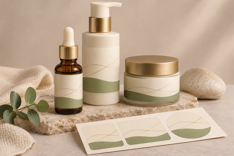
Cosmetic labels help a skincare range look connected while allowing customers to identify each product quickly. The most effective system carries the same core brand cues across bottles and jars, then adapts the layout to each container’s usable labelling area, shape and viewing angle.
For skincare brands, retailers and e-commerce teams in South Africa, this means planning labels around the actual serum bottle, pump, cream jar or gift-set format—not designing one flat artwork file and forcing it onto every pack. XGolden Print designs and produces custom labels and stickers for bottles, jars, boxes and bags, with support for artwork, material selection, sample approval and agreed roll or sheet formats.
One skincare range across different containers
A skincare product line may include a tall serum bottle, a pump bottle, a wide cream jar and a smaller travel-size product. These containers can sit together in retail, appear in an online product image, or be assembled into a skincare gift set. Cosmetic labels should make them visibly related without making them difficult to tell apart.
Start by defining the elements that remain consistent across the range:
- Brand name and logo position
- Type style and hierarchy
- Colour system
- Product category naming
- Variant markers, such as a colour band or symbol
- Illustration, pattern or graphic device
- Placement of essential product information supplied by the brand
Then identify what can change for each container. A jar usually gives a wider, lower front panel, while a serum bottle offers a narrow, vertical space. The design does not need to look identical at every size; it needs to feel like one family and remain easy to read in use.
For example, a serum label may lead with the brand, serum name and variant colour in a vertical sequence. A cream jar can use its broader front panel for a more horizontal composition, with the product name clearly centred. Repeating the same typeface, colour relationships and naming structure creates consistency even when the label proportions differ.
A coordinated label system is particularly useful for:
| Skincare use case | Label requirement | Practical option to consider |
|---|---|---|
| Serum bottles on retail shelving | Fast recognition from the front | Clear brand and product name hierarchy |
| Pump bottles used daily | Information visible while held upright | A front panel with supporting copy around the side |
| Cream jars with broad faces | Readable display on a low, wide surface | Wider product-name area and simplified layout |
| Product variants in one range | Easy distinction between similar products | Controlled colour, icon or variant-name system |
| Online orders and product photography | A consistent range appearance | Repeated logo position and recognisable visual cues |
| Skincare gift sets | Products that read as a coordinated collection | Matching labels paired with branded outer gift packaging |
The label is applied to the outside of the primary container. It supports identification and presentation; it does not replace the container or determine the compatibility of the product formulation with its bottle, jar, closure or pump. Where skincare products are grouped in cartons or gift boxes, the outer packaging serves a separate retail and gifting role rather than functioning as a complete transport-protection system.
Fitting the layout to a serum bottle and cream jar
The usable label panel matters more than the nominal bottle or jar size. Curves, shoulders, seams, bases, lids, pumps and raised features can all reduce the area available for clear artwork. Before finalising cosmetic labels, measure the area where the label will sit rather than measuring only the container’s overall height or diameter.
For a serum bottle, consider:
- The straight-sided area between shoulder and base
- Whether the bottle has a pronounced curve or taper
- The position of the pump, pipette, cap or collar
- How much of the front is visible when the product is displayed upright
- Whether a full-wrap label would cross an uneven or restricted area
- The reading direction when a customer picks up the bottle
A tall narrow label can suit a serum bottle, but tiny type and over-packed copy often become hard to scan. Put the product name, variant and brand identifier in the most stable, visible front area. Supporting brand-approved information can be arranged on the side or back, provided the available panel is confirmed from the actual container.
For a cream jar, plan around a different set of constraints:
- The jar’s circumference and curved sidewall
- The height of the side panel
- Any taper from top to base
- Whether the lid also needs artwork
- The front-facing position when the jar is displayed or photographed
- The relationship between side label and lid design
A jar label that wraps too far around a small container can make the front look crowded. A shorter front-focused label may be more suitable where the product name needs prominence. Conversely, a wider wrap can provide room for the brand-approved copy if the jar has a sufficiently regular sidewall.
Avoid designing from a digital container outline alone. Request the final filled bottle or jar, or a representative container sample, before deciding the label dimensions. Filling, assembly and closure selection can affect how the finished pack is handled and viewed.
Keep the artwork inside a realistic usable panel
The ideal artwork area is not always the same as the maximum physical area. Leave visual breathing room near curves, edges and seams. Fine rules, small type and critical text placed too close to a label edge can be less forgiving on curved containers.
An artwork review should establish:
- The intended front-facing panel.
- The label width and height for each container format.
- The position of the opening, seam or overlap if relevant.
- The direction in which the design should be read.
- Whether the design needs separate versions for bottle, jar and lid.
- Which brand-approved product details must be prioritised.
This preparation makes it easier to create cosmetic labels that retain the intended appearance once applied, rather than only on screen.
Keeping product names and variants easy to distinguish
A skincare range often contains products with similar names: hydrating serum, brightening serum, night cream, daily cream or a range of scent-free and scented options. If every label uses the same visual weight for every word, customers may struggle to identify the right product from a shelf, bathroom cabinet or online unboxing.
Use a clear content hierarchy. In most cases, the reader should be able to find the following in seconds:
- The brand
- The product category
- The specific product or variant
- The product size or other brand-approved detail where required
The product category should not compete with the variant name. For instance, if several products are all serums, “serum” can be given a consistent supporting position while the individual variant receives stronger emphasis. A colour code can help, but should not be the only distinction. Names, symbols or short descriptors give shoppers another way to identify products.
For South African skincare buyers preparing a range for retail shelves, online orders or event gifting, consider whether the label will be viewed at arm’s length, under store lighting, in a product photograph or in someone’s hand. A premium-looking label that is difficult to read can create unnecessary selection errors, especially where several containers share one silhouette.
If your range uses more than one language in its approved artwork, build that choice into the layout from the beginning. Adding further copy late in the process can upset the hierarchy, reduce type size and compromise the clarity of the front panel. XGolden Print can provide artwork support, but the brand should supply the final approved product copy and confirm the information to be included.
Create a variant system that scales
A useful variant system should work for the first three products and for future additions. Before committing to a label direction, test whether it can accommodate:
- A new serum or moisturiser
- A smaller travel format
- A larger jar
- A limited-edition gift set
- A product sold individually and in a collection
Choose visual cues that can be expanded carefully. For example, a fixed product-name location with a controlled colour field may be easier to maintain than a design where each variant uses a completely different layout.
LS-301 serum-bottle and LS-304 skincare-jar label examples
The container should guide the label choice. XGolden Print’s LS-301 frosted serum bottle labels provide a relevant catalogue example to review when planning artwork for a serum-bottle format. Use the example to consider how the label composition relates to a tall skincare container, then confirm the final dimensions and construction against your own bottle.
For a jar-led range, the LS-304 clear skincare jar labels offer a relevant example for considering label presentation on skincare jars. The product name indicates the intended style example, but buyers should not assume a particular film type, adhesive rating, moisture resistance or suitability for a specific jar from the name alone. Those requirements need to be discussed for the individual project.
The two examples underline why a single piece of artwork may need careful adaptation. A narrow serum format may suit a focused front label with vertically organised content. A clear jar may require the team to consider how the product, jar appearance and label artwork read together. The label background, print contrast and visible container contents can all affect the final presentation.
When briefing either format, provide:
- Container drawings or physical samples
- Filled and unfilled container dimensions where available
- The intended label position
- Product photos or renders if the labels must match existing packaging
- Brand artwork, colour references and approved copy
- Whether labels will be supplied on rolls or sheets
- The application method and expected order quantity
XGolden Print can specify custom label dimensions, shapes and agreed roll or sheet formats. These choices should support the actual application process, whether labels are placed by hand during a small launch or incorporated into a repeatable packing workflow.
Reviewing moisture, oils and handling conditions
Skincare labels are often exposed to conditions that differ from a dry retail carton. Serum bottles may be handled with oily fingers. Cream jars may be opened and closed frequently. Products can be kept in bathrooms, carried in travel bags or included in a gift set where containers rub against one another during packing.
These are conditions to test, not performance characteristics to assume. Oil, moisture, friction, condensation, product residue, filling processes and container surface treatments can affect the label result. The right material and finishing decision depends on the specific product, container and use conditions.
Discuss the intended environment early, including:
- Whether the product may be handled with damp hands
- Whether oils, creams or residue may reach the label
- How often the container is opened and closed
- Whether labels will contact other products in a kit or gift box
- Whether the containers will be manually labelled or applied by a machine
- How products will be packed for retail, online fulfilment or gifting
- Whether the product may be stored in humid areas
A label that looks appropriate on an empty container may behave differently once the container is filled, capped, packed and used. Test samples on the actual filled containers where possible. Check appearance, placement, edges, readability and the overall presentation after handling under the conditions relevant to the product line.
Material selection and finishing are application decisions rather than default upgrades. XGolden Print can support material selection for the project, but buyers should confirm suitability, finishes and test requirements against their specific containers and use conditions.
Approving artwork on the filled containers
A screen proof is useful for reviewing content and layout, but it cannot show every practical aspect of a label on a curved, filled bottle or jar. Approval on the actual container is the key final check for a coordinated skincare range.
Review the label in realistic situations:
- Upright on a retail shelf or display surface
- Held in one hand
- Next to other variants in the range
- Inside the intended gift set or outer box
- Photographed for online product pages
- Packed in the planned e-commerce order configuration
- Opened and closed where the label sits near a lid, closure or handling point
Check that the front label stays front-facing when the product is packed. A jar can rotate in a gift box; a bottle can turn during fulfilment. If the product is sold in a set, consider fitted inserts or dividers in the outer gift packaging to keep containers organised and presentable. XGolden Print offers gift packaging planning around multiple products, coordinated branding and the intended opening experience, as well as fitted inserts for suitable packaging projects.
Do not treat the retail box or gift box as the only safeguard for online shipping. Outer presentation packaging, inserts and transport protection are separate considerations. Review the full packing workflow: the primary container, its label, any individual carton, the gift set arrangement and the transport packaging selected for the delivery journey.
A practical approval checklist
Before production, confirm the following for every serum bottle and cream jar:
- Final container supplier sample and filled product sample
- Actual usable label panel and final label dimensions
- Correct orientation and front-facing position
- Brand-approved product names, variants and supporting copy
- Consistent colours and type hierarchy across the range
- Variant distinction when containers sit side by side
- Label shape, roll or sheet format and application method
- Relevant moisture, oil and handling conditions to test
- Appearance within any retail carton, gift box or insert
- Sample approval before production
XGolden Print supports structural design, material selection, artwork support, printing, finishing, fitted inserts and sample approval before production. For cosmetic labels, that support helps turn a brand system into labels that are planned around the real bottles and jars rather than generic templates.
For a broader view of custom formats for containers, boxes and bags, explore XGolden Print labels and stickers. When requesting a quote or project discussion, share the bottle and jar dimensions, quantity, artwork, application format, required delivery date and delivery destination. XGolden Print can then help you develop cosmetic labels suited to your skincare range and its intended presentation.
