
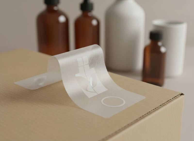
A well-designed label sticker makes a product easier to identify, use and trust. It should communicate the essentials at a glance, stay readable at its final size, adhere reliably to its intended surface and look intentional alongside the packaging.
This label sticker design 101 guide covers the decisions that matter before artwork goes to print: what information to include, which material and finish to choose, how to match labels with boxes, and where to check product-specific requirements for the South African market.
Essential Elements of a Product Label Sticker
Start with the information a customer needs before adding decorative details. A label has limited space, particularly on jars, bottles, small cartons and gift packaging, so hierarchy matters more than trying to fit in every message.
Most product labels need a clear version of the following:
- Brand name or logo: Place it where it can be recognised quickly.
- Product name: State precisely what the item is, rather than relying on imagery alone.
- Variant or key descriptor: For example, flavour, fragrance, colour, size, collection or product type.
- Net quantity: Use the applicable unit and presentation for the category and target market.
- Instructions: Include concise use, storage, preparation or care information where relevant.
- Ingredient, material or component information: Add this when relevant to the product type and verify the required format.
- Warnings or precautions: Make safety information visible rather than hiding it in fine print.
- Business and traceability details: Product categories may require identifiers, batch information, dates or responsible-party details. Confirm what applies before final approval.
- Barcode or QR code: Leave adequate clear space around a barcode, and test it from a printed proof rather than only on screen.
Build a clear reading order
A customer should generally be able to identify the brand, product and main differentiator in a few seconds. Create this order through contrast, placement and type size—not simply by making every element bold.
A practical hierarchy often looks like this:
- Brand
- Product name
- Variant or primary benefit
- Required product information
- Supporting story, directions or promotional detail
Avoid treating the back label as an overflow area for everything that did not fit on the front. If required information makes the design crowded, consider a larger label, a wrap-around format, a secondary label, or a box that can hold longer copy.
Design for the real label size
Artwork viewed at 100% on a monitor can be misleading. Print the design at final size and review it under ordinary lighting. Check whether the smallest text is comfortable to read, whether fine rules remain visible and whether icon details still make sense.
Common readability problems include:
- Light text over a busy image
- Narrow typefaces at very small sizes
- Low contrast between text and background
- Copy too close to the die line
- Important text running over a curve, seam or closure
- Too many font styles competing for attention
Use a restrained font system and keep essential copy in a straightforward, highly legible typeface. Decorative lettering can support the product name, but it should not make basic information difficult to find.
Choosing the Best Sticker Material: Vinyl, Paper or Kraft
The right material depends on the product environment, application surface and intended brand feel. A material that looks excellent on a dry paper box may be a poor choice for a chilled bottle, a curved container or a product exposed to handling.
When comparing custom printed stickers, provide the printer with the packaging substrate, container shape, application method and expected conditions of use. These details influence material and adhesive recommendations.
| Material | Best suited to | Strengths | Points to check |
|---|---|---|---|
| Paper | Dry indoor products, cartons, retail sleeves and short-term promotions | Familiar print surface, adaptable appearance, often suitable for detailed graphics | Moisture resistance, scuffing, adhesive suitability and handling conditions |
| Kraft paper | Natural, handmade, rustic or environmentally minded visual concepts | Warm texture and uncoated appearance; works well with simple, high-contrast artwork | Printed colours may look muted; fine detail and light colours may be less distinct |
| Vinyl | Containers and applications needing greater durability or moisture resistance | Flexible, resilient and often well suited to curved or frequently handled surfaces | Finish, adhesive, recyclability considerations and compatibility with the container surface |
Paper labels: versatile, but environment-sensitive
Paper labels suit many dry goods, box seals, garment packaging, candles and presentation packaging. They can support polished colour printing or a more tactile uncoated look, depending on the stock and finish selected.
Their limitation is exposure. Condensation, oil, friction and prolonged moisture can affect appearance or adhesion. Confirm the conditions your product will experience after packing, including refrigeration, bathroom humidity, transit and customer handling.
Kraft labels: use contrast to your advantage
Kraft stock gives a distinct natural brown base that becomes part of the design. Black, dark brown and deep single-colour artwork often produces the clearest result. White ink may be available for some print processes, but it should be confirmed with the supplier rather than assumed.
Because the base is not white, process colours can shift visually. A pale yellow, pastel pink or light grey design may have less impact than it would on white stock. Use a proof or material sample when colour accuracy is important.
Vinyl labels: useful where paper may struggle
Vinyl is often considered for products that face splashes, regular wiping or demanding handling. It can also be a practical option for curved jars, tubs and bottles because of its flexibility.
However, “vinyl” does not answer every technical question. Adhesive performance depends on the surface, temperature, application timing and product exposure. A label may need to adhere to glass, coated board, plastic, metal or a textured surface, each with different demands. Request a sample application before committing to a large production run.
Die-Cut vs. Kiss-Cut: Defining Your Sticker Shape
Die-cut and kiss-cut describe how stickers are cut, and the choice affects both presentation and application.
A die-cut sticker is cut through the sticker material and backing into the shape of the finished sticker. Each sticker is supplied as an individual shape, such as a circle, oval, badge, logo silhouette or custom outline.
A kiss-cut sticker cuts only the sticker face material while leaving the backing sheet intact. The sticker can have a custom shape, but it remains on a larger backing sheet or sheet format.
| Feature | Die-cut | Kiss-cut |
|---|---|---|
| Finished appearance | Individual sticker in its final outline | Sticker remains on a backing sheet |
| Handling | Often suitable for single-piece inserts or hand application | Useful for sets, sheets and easier peeling |
| Visual impact | Strong custom silhouette | Backing can frame or protect intricate shapes |
| Complex shapes | Possible, subject to practical cutting limits | Often helpful for detailed shapes because the backing stays whole |
| Packaging use | Seals, branded inserts, product labels | Multi-sticker sheets, promotional sets and organised application |
Choose the shape around the application
A rectangle with rounded corners is usually efficient, easy to align and suitable for most packaging. Circular labels work particularly well on lids and seals. Custom contours can be memorable, but they should earn their place by reinforcing the brand or fitting the packaging form.
Avoid extremely sharp points, very narrow sections and intricate internal cut-outs unless you have checked their practicality. These details can be harder to remove from the backing, align by hand and keep intact during handling.
Also leave enough space between important text and the cutting edge. A sensible safety margin protects the design from minor registration variation and prevents a crowded result.
Colour Consistency Between Labels and Paper Boxes
A label and paper box are rarely printed on identical materials or by exactly the same production method. Even when the same colour values are used in the artwork, a glossy white label and an uncoated carton can make that colour appear different.
This does not mean matching is impossible; it means colour should be managed as a packaging system rather than as separate files.
Start with a shared colour plan
Use the same approved brand assets across label and box artwork, including logo files, colour references and typography. For brand-critical shades, identify whether the colour should be reproduced using process colour, a specified spot colour or another agreed approach. Your printer can advise on the options available for the selected substrates and process.
When developing custom packaging boxes, share the label artwork at the same time. This lets the packaging team assess the interaction between:
- White, coated or uncoated surfaces
- Kraft or coloured board
- Matte and gloss finishes
- Large solid colour areas
- Foil, embossing or other decorative elements
- The label’s final position on the box
Review physical proofs where possible
A digital mock-up is useful for layout, but it cannot fully show substrate texture, ink absorption, sheen or the contrast between two printed components. A physical proof or sample is especially valuable for dark colours, pastels, neutral shades and closely matched brand colours.
If a precise visual match is not feasible across different stocks, make the difference look deliberate. For example, use the box as a quieter, textured base and let the label carry a cleaner, higher-contrast version of the mark. Consistency in hierarchy, type and overall tone can be more important than forcing two materials to look identical.
Compliance and Regulatory Information on Labels
Packaging design should make room for information that may be required for the product category. The obligations can differ significantly for food, beverages, cosmetics, supplements, household goods, children’s products, chemicals, electrical items and other regulated categories.
Before printing, verify the current requirements that apply in South Africa to your particular product, including:
- Mandatory statements and warnings
- Ingredient or composition declarations
- Allergen, hazard or safety information
- Quantity, measurement and date-marking rules
- Language, legibility and minimum text-size expectations
- Responsible business or importer details where applicable
- Barcode requirements from your retail channel
- Claims about health, sustainability, origin, performance or suitability
Do not rely on a label template from another product category or another market. A claim such as “natural”, “eco-friendly”, “clinically tested”, “recyclable” or “safe for children” may need substantiation and careful wording. If in doubt, obtain category-appropriate regulatory or legal advice before sign-off.
Make required information easy to find
Compliance copy is still customer-facing copy. Use a clean panel, adequate contrast and sensible spacing. Do not place mandatory details over a fold, closure seam, barcode, textured illustration or high-gloss reflection point.
Where the information is extensive, a carton, sleeve or booklet may offer a better solution than shrinking text until it is unreadable. The label and outer packaging should also be checked together to ensure the customer receives all necessary information at the point of sale and after opening.
The Impact of Finish: Matte, Gloss or UV Coating
A finish changes both the look and practical behaviour of a sticker. It can influence how colours appear, how easily the label shows fingerprints and how it stands up to ordinary scuffing.
| Finish | Typical visual effect | Good fit for | Consider before choosing |
|---|---|---|---|
| Matte | Soft, low-reflection and contemporary | Premium, minimalist, natural or tactile branding | Dark matte areas may show marks; small text needs adequate contrast |
| Gloss | Bright, reflective and colour-enhancing | Bold graphics, colourful products and high-impact retail display | Reflections can affect readability under strong lighting |
| UV coating | Protective coated effect, either across the label or in selected areas | Emphasising logos, patterns or selected visual details | Confirm coating coverage, writing needs and compatibility with the chosen stock |
A matte finish can make a product feel restrained and refined, especially with simple typography and plenty of negative space. It also reduces glare, which may help readability.
A gloss finish can add vibrancy and visual energy, particularly to photographs and saturated colours. On the other hand, heavy reflection can make fine copy harder to read under certain lighting.
UV coating can be applied broadly or used selectively to highlight a logo, product name or pattern. Spot effects work best when they support an intentional visual hierarchy rather than being added simply because they are available.
Always consider the customer journey. A finish chosen for shelf impact should still work when the product is photographed for an online store, handled repeatedly or viewed in different lighting.
Sticker Placement Strategy on Gift Packaging
Sticker placement should look planned, not like an afterthought. On gift packaging, a sticker can serve as a seal, brand signature, product identifier, seasonal detail or personalisation element.
For gift packaging, decide whether the sticker’s primary job is decorative, functional or informational. This determines the position and size.
Common placement options
- Centred on the lid: Creates a balanced branded presentation and works well for logos or product names.
- Across a lid or opening seam: Functions as a seal and gives the customer a clear opening point.
- On a side panel: Keeps the top surface clean while allowing space for product details.
- On an inner tissue seal or belly band: Adds a reveal moment without permanently covering the box.
- On a hang tag or insert: Useful when the box is reused or when variable information is needed.
- On the base: Suitable for technical details, batch information or a discreet barcode, provided it remains practical for retail handling.
Check the placement physically
A placement that works in a flat artwork file can fail on an assembled box. Test the actual opening motion and ensure the sticker does not tear the surface, obstruct a closure or sit across an edge in a way that causes lifting.
Avoid placing key information over:
- Box folds or corners
- Embossed, debossed or heavily textured areas
- Magnetic closures and moving flaps
- Ribbon paths or handles
- Surfaces likely to rub against another package during stacking
For e-commerce gift sets, consider how the package will look after a shipping label or handling marks are applied to the outer shipper. The branded sticker is often best reserved for the customer-facing gift box rather than the transport packaging.
How to Ensure High-Resolution Printing for Small Text
Small text depends on more than a high-resolution logo file. It requires appropriate artwork setup, sensible type choices, sufficient contrast and a print process that suits the level of detail.
Follow these practical checks before approving sticker artwork:
- Use vector artwork for logos, icons and line illustrations. Vector files remain sharp when scaled and are preferred for clean edges.
- Use high-resolution images at their final printed size. Enlarging a small web image can create softness or visible pixelation.
- Avoid very thin font weights. Fine strokes may fill in, break up or lose clarity depending on the material and print method.
- Keep reversed-out text practical. White or light text on a dark background needs enough weight and size to remain open and readable.
- Set barcode artwork correctly. Do not stretch, compress, crop or place a barcode too close to other design elements.
- Allow for bleed and a safety area. Artwork that runs to the edge needs bleed; important text and logos should sit safely inside the cut line.
- Inspect a printed proof at actual size. Check spelling, spacing, colour, fine lines, barcode scannability and required copy before full production.
Know when to simplify
If a label is too small for the amount of text required, no print setting will solve the underlying design problem. Reduce optional copy, move detailed instructions to a box or insert, enlarge the label, or use a multi-panel format.
The best small label designs are often the simplest: a prominent product name, one clear visual cue and only the information that belongs on that surface.
FAQ
Should labels be designed before or after the packaging box?
Design them together where possible. The label size, material, finish and placement affect how the final pack looks, while the box may provide space for information that does not fit on the label.
Can one sticker material work for every product?
Not reliably. A dry carton, a glass bottle, a chilled container and a textured plastic tub can require different material and adhesive choices. Match the sticker to the surface and conditions it will face.
Is gloss or matte better for product labels?
Neither is universally better. Choose gloss for stronger visual brightness and matte for a softer, low-reflection look. Test the finish with your artwork, packaging material and retail lighting conditions.
What should be checked before approving a label print run?
Confirm final dimensions, spelling, required information, colour references, barcode setup, bleed, safety margins, material, adhesive, finish, cut style and placement on the actual package.
A strong label begins with a clear job: identify the product, communicate essential information and support the packaging experience. Once those basics are resolved, material, cut shape and finish can reinforce the brand rather than compensate for an unclear design. For complex packaging projects, XGolden Print’s company profile provides additional context on its custom printing and packaging capabilities.
