
Packaging priorities for household chemical products where clarity and trust matter most
For household chemical brands in South Africa, packaging is not only a container. It is the first safety instruction, the first trust signal, and often the first reason a shopper decides whether a product feels reliable enough to place in a trolley or cart. Across Johannesburg, Cape Town, Durban, Pretoria, Gqeberha and fast-growing e-commerce corridors linked to the Port of Durban and the Port of Cape Town, brands are facing the same pressure: make cleaners easy to identify, easy to use correctly, and hard to misunderstand.
The most effective household chemical packaging combines clear hierarchy, enough regulatory and practical information, durable materials, and a packaging structure suited to the product format. A trigger-spray degreaser, a refill pouch, a pod carton, and a concentrated floor cleaner should not be treated as if they all need the same label area, the same outer box, or the same retail presentation. Strong packaging development begins by deciding what the product must communicate in the real world: what it is, how to dilute or use it, where to store it, what hazards apply, and how the pack should perform from warehouse to shelf to doorstep delivery.
In South Africa, this becomes even more important because products often move through mixed retail channels. One SKU may be sold through supermarket shelves in Sandton, independent hardware stores in Bloemfontein, cleaning-supply distributors in Durban, and online marketplaces serving households in Polokwane or Mbombela. The packaging therefore needs both market fitness and operational resilience. That is where custom cartons, structured labels, and carefully planned sticker systems can make a measurable difference.
South African market context for household chemical packaging

The local market is broad: dishwashing liquids, bathroom cleaners, laundry aids, disinfectants, drain treatments, toilet care products, air-care chemicals, degreasers, stain removers and refill systems are all competing for visibility. Consumers are more alert to safety wording than before, while retailers increasingly expect neat shelf presentation, clean barcode placement, and stronger packaging consistency across product families. E-commerce has also changed design priorities. A pack that works on a shelf may fail in courier handling if the outer carton is not selected properly.
Another local factor is climate and logistics variation. Heat exposure during transport inland, humidity near coastal routes, and repeated handling through distribution centres can affect adhesive performance, print legibility and carton compression. That is why household chemical packaging for South Africa often needs a practical balance of coated boards, moisture-aware label stocks, and tamper-evident or variation-control stickers where appropriate.
Brands that succeed usually treat the pack as a system: primary container, front label, back label, variable stickers, transit box and sometimes bundle sleeves or subscription-ready outer cartons. Businesses that want to scale across categories often explore custom box solutions early, so they can create a consistent structure for retail, shipping and promotional bundles instead of redesigning each launch from scratch.
Packaging roles for cleaners, refill systems, pods, concentrated products, and multi-packs
Different household chemical formats require different packaging roles because the user interacts with each pack in a different way. A standard surface cleaner bottle relies heavily on the main label for identity and usage direction. A refill system depends on the consumer understanding transfer steps, dilution ratios and compatibility with the original container. Pods need especially careful communication because convenience formats can be visually mistaken for low-risk consumer goods if the carton design is too playful or too minimal.
Cleaners in spray, squeeze or pour formats usually need the primary label to do the heavy lifting. It must identify the cleaning purpose immediately, distinguish fragrance or formula variations, and reserve enough space for directions, storage guidance and safety statements. For refill systems, the packaging role shifts slightly. The shopper must first understand that the product is a refill, not a ready-to-use pack. Then the pack must guide pouring or insertion steps clearly. Refill pouches and compact cartons often save material, but they reduce printable surface area, which means layout discipline becomes essential.
Concentrated household chemicals bring another packaging challenge: they often promise value and lower transport volume, yet they increase the importance of accurate dosage messaging. If a concentrated bathroom cleaner or laundry additive is overdosed because the pack under-explains dilution, the brand may face complaints not because the formula is poor, but because the packaging failed to coach the user. In these cases, extended-content labels, fold-out instructions or targeted stickers can be useful.
Pods and tablets require pack design that reduces ambiguity. The outer carton should not overemphasise fragrance, colour or softness cues at the expense of safety language. The structural pack also matters. Strong closing performance, clear count indication, and front-facing warnings support safer handling and easier retail review. Multi-packs add another layer. If the product is sold as a family bundle or promotional set, the outer packaging should explain whether inner units can be sold separately, whether usage instructions apply per unit, and how lot or formula variation is managed.
| Product format | Main packaging task | Key label need | Outer box role | Common risk | Practical solution |
|---|---|---|---|---|---|
| Trigger-spray cleaner | Fast identification on shelf | Clear use area and warnings | Transit protection for caps and triggers | Leaking in shipment | Partitioned shipper and moisture-resistant label stock |
| Refill pouch | Explain transfer and refill purpose | Step-by-step refill directions | Bundle support for promotional sets | Shoppers think it is ready to use | Large refill cue and coloured instruction sticker |
| Pods or tablets | Secure count pack and risk communication | Storage and child-safety visibility | Retail-facing carton with firm closure | Pack appears too playful | Sharper warning hierarchy and restrained graphics |
| Concentrated liquid | Communicate value per dilution | Dilution chart and dosage | Shipping efficiency for smaller unit size | Misuse through overdosing | Back-panel chart and neck sticker reminder |
| Multi-pack bundle | Show combined offer clearly | Variant identification | Keep units stable in transport | Confusion about included items | Windowed carton or printed contents panel |
| Bulk household cleaner | Support institutional purchase | Handling and decanting notes | Stacking and warehouse efficiency | Poor readability at distance | Large-format print zones and bold product code |
The table shows why pack planning should start with product behaviour, not decoration. The same visual template may look efficient internally, but it can create safety and usability gaps when applied across formats with different handling risks.
How labeling space and warning content affect packaging development
Labeling space is often the hidden driver of packaging development. Many household chemical brands choose a bottle or pouch first, then discover too late that they do not have enough room for hazard wording, usage instructions, dilution guidance, batch coding, barcode placement and multilingual customer information. When that happens, design compromises appear quickly: font sizes shrink, warning content becomes crowded, or important directions move to awkward positions that are hard to find during use.
For South Africa, where products may need to address varied retail environments and diverse user expectations, clarity matters more than visual density. If a label needs to carry safety notes, dosage guidance, first-aid basics, storage instructions and product variation details, the packaging team should decide early whether the format requires a taller label panel, a wrap label, a double-sided label, a peel-and-read construction, or supplementary stickers.
Warning content also affects the shape and face area of secondary packaging. A pod carton, for example, may need enough front-panel real estate for category recognition and immediate caution language. A concentrated refill product may need a side panel wide enough for pictorial dilution instructions. These decisions can influence dielines, print layout, carton board choice and even case pack dimensions. In other words, labeling is not a late-stage graphic task. It shapes the physical packaging platform itself.
Good development practice maps required information into tiers. Tier one is instant recognition: product type, key purpose and major safety cue. Tier two is correct use: dose, dilution, application area and storage. Tier three is supporting information: batch coding, manufacturer details, internal traceability, promotional details and customer support. Once these tiers are clear, the design team can allocate space instead of fighting for it.
| Content requirement | Space demand | Packaging impact | Design response | Operational effect | Benefit |
|---|---|---|---|---|---|
| Usage directions | Medium to high | Larger back panel needed | Wrap label or extended back section | Longer artwork planning | Fewer misuse complaints |
| Safety warnings | High | Front and side visibility required | Priority hierarchy in layout | More approval checkpoints | Improved consumer trust |
| Dilution chart | Medium | Panel width must be readable | Icon-based instruction block | Print proofing becomes critical | Clearer concentrated product use |
| Batch and date coding | Low | Reserved clean area needed | Blank code zone or sticker zone | Faster line coding | Better traceability |
| Variation details | Low to medium | Front differentiation required | Colour strip or SKU sticker | Simplifies version control | Reduces pick errors |
| Retail barcode and compliance marks | Low | Flat scannable space required | Dedicated lower panel | Less scanning trouble | Smoother retail handling |
This table highlights a common truth in household chemical packaging: every line of mandatory or practical information competes for physical space. The best outcome comes when structural packaging and artwork are developed together.
Sticker solutions for directions, safety notes, and product variation management
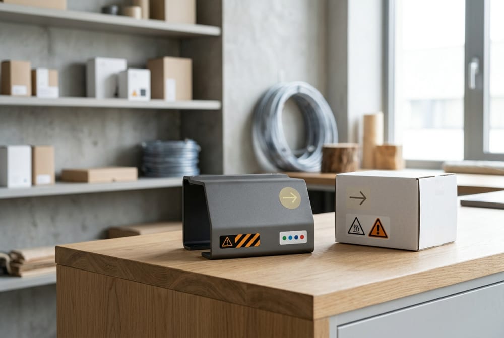
Stickers are often treated as a temporary fix, yet for many household chemical brands they are a smart and scalable packaging tool. They can help manage multi-variant ranges, support low-volume launches, add market-specific instructions, reserve space for promotional changes, and simplify updates without fully reprinting cartons or labels. When used well, sticker systems are not messy add-ons. They are part of a controlled packaging strategy.
Direction stickers can be especially useful for concentrated products, refill packs and bundled sets. A neck sticker on a bottle can reinforce dosage. A front-corner sticker can identify “refill only” more strongly than the base artwork. A side sticker can carry temporary instruction updates during a formula transition. For safety notes, stickers can support high-visibility alerts where the printed label is already crowded, provided they are applied consistently and remain legible throughout distribution.
Variation management is another major advantage. Household chemical lines often expand into fragrance options, surface-specific formulas, antibacterial claims or seasonal bundles. Instead of carrying separate fully printed cartons for every minor change, a brand can create a core packaging platform and use carefully designed stickers to distinguish variants. This reduces packaging complexity while preserving brand consistency.
That said, stickers need discipline. Adhesive performance must suit local storage conditions. Print contrast must remain strong. Placement guides should be exact so retail presentation stays tidy. For brands developing multiple SKUs or mixed packs, professionally produced custom sticker solutions can improve version control and keep information updates manageable without slowing launch cycles.
| Sticker type | Main purpose | Best application area | Ideal product type | Operational benefit | Important caution |
|---|---|---|---|---|---|
| Neck sticker | Quick dosage or refill cue | Bottle neck or shoulder | Sprays and concentrates | Adds visibility without redesign | Must not obstruct opening |
| Corner alert sticker | Highlight safety or refill status | Front top corner | Refill packs and strong cleaners | Fast shopper recognition | Keep alignment consistent |
| Variant code sticker | Differentiate formulas or scents | Front or side panel | Multi-SKU ranges | Reduces obsolete packaging stock | Needs clear SKU logic |
| Instruction sticker | Add temporary use steps | Back panel or closure area | Concentrates and pods | Supports launch flexibility | Text must remain readable |
| Tamper-evident seal | Show pack integrity | Closure or opening seam | Bottles and cartons | Boosts trust for online delivery | Material must resist tearing too easily |
| Bundle identification sticker | Clarify pack contents | Outer carton face | Promotional multi-packs | Speeds retail handling | Should match final packed contents |
The explanation here is straightforward: stickers work best when they add control, not clutter. They are most valuable when paired with a clear application process and a stable base design system.
Outer box choices for online shipment, retail shelf placement, and bundled products
Outer packaging plays different roles depending on channel. In retail, the outer box may function mainly in transit and stock replenishment. In e-commerce, it becomes the main protective shell against compression, puncture and leakage risk. In bundled products, it may also act as the selling face, especially for giftable cleaning sets, starter refill kits or household maintenance combos. This means one-size-fits-all shipper design rarely delivers the best result.
For online shipment in South Africa, outer boxes need to account for variable courier handling and route duration, especially for deliveries moving between major metros and secondary towns. Bottle movement, cap pressure, and internal abrasion can damage labels or create an unclean arrival experience even when the product itself has not failed. Inserts, dividers and board grade selection can reduce this problem significantly.
Retail shelf placement has a different priority. Shelf-ready cartons should open neatly, present the brand frontally, and avoid obstructing warnings or product identification. If a retailer places products in compact shelving or high-turn displays, case dimensions and tear-away features need careful thought. Bundled products require an additional decision: should the box reveal the items, describe them through print, or combine both? For entry-level consumer trust, a clean explanation of what is inside is often better than overly decorative outer packaging.
| Channel | Main box requirement | Structural priority | Print priority | Common failure point | Suggested improvement |
|---|---|---|---|---|---|
| E-commerce single order | Protection against rough handling | Compression strength and void control | Basic brand and handling info | Internal movement | Add inserts or snug fit partitions |
| Retail shelf replenishment | Efficient opening and stocking | Tear-open access | SKU readability | Slow shelf replenishment | Use shelf-ready case design |
| Club or cash-and-carry | Stacking and count visibility | Higher board strength | Large quantity marking | Carton collapse in stack | Upgrade flute or board grade |
| Promotional bundle | Explain included units clearly | Stable internal fit | Offer communication | Confusing bundle message | Front contents diagram |
| Subscription refill kit | Repeatable unboxing and low waste | Compact pack geometry | Instruction clarity | Poor refill orientation | Add inside-lid guide panel |
| Distributor shipping case | Warehouse efficiency | Stack and pallet stability | Large side coding | Pick errors | Use bold product identifiers on two sides |
The practical lesson is that outer cartons should be channel-specific whenever the economics justify it. A shelf-ready retail case and a courier-resistant e-commerce shipper often serve different jobs and should be evaluated separately.
Packaging directions for eco-positioned or refill-based household brands
Eco-positioned and refill-based brands are growing in South Africa, especially in urban markets where consumers are more open to reduced packaging formats, concentrate systems and lower-waste routines. However, sustainability positioning can backfire if the pack becomes vague or inconvenient. A refill product still needs to feel safe, legible and credible. A “green” look should never remove the practical signals that tell the user exactly what is inside and how to handle it.
For refill-based systems, the first direction is simple: make the refill status unmistakable. The second is to explain compatibility. The consumer needs to know whether the refill goes into the brand’s original bottle, whether dilution is required, and whether any rinsing or measuring step is needed. Eco-positioned packaging also benefits from transparent material and disposal messaging, but this should remain secondary to use and safety clarity.
Brands should avoid making eco claims the dominant visual layer if this causes the pack to understate that it is still a chemical cleaner. Natural colours, kraft-like finishes and soft typography can work, but only when they do not blur function or reduce the seriousness of the product category. The best refill packaging combines reduced material use with higher instruction precision.
Looking toward 2026, refill systems, concentrated home-care formats and lower-cube shipping models are likely to gain more attention as transport costs, retail efficiency and sustainability reporting all become more significant. Policy scrutiny around packaging waste and clearer consumer communication is also likely to push brands toward packs that are both materially leaner and informationally stronger.
Design decisions that can unintentionally make chemical products feel unsafe
Chemical products do not only feel unsafe when warnings are present. They can also feel unsafe when design choices create confusion, exaggerate harshness, or undermine trust. One common mistake is chaotic information layering. If the front panel is overloaded with claims, icons, promotional language and bright conflict-heavy colours, the pack can feel aggressive or difficult to understand. Another mistake is the opposite: the design becomes so minimal and lifestyle-oriented that the product appears under-explained.
Overly playful visuals are risky for pods and highly concentrated products. Excessive use of candy-like colours, soft illustrations or fragrance-led design cues can reduce the perceived seriousness of the pack. On the other hand, using hazard-heavy styling without balance can make even an ordinary bathroom cleaner feel alarming. Consumers generally trust packs that are calm, direct and ordered. They want to see competence more than drama.
Poor print contrast also matters. If a shopper must strain to find instructions or warnings, confidence drops. In local retail environments with fluorescent store lighting or compact shelf presentation, low-contrast text becomes even harder to use. The same applies to low-grade label materials that wrinkle, smudge or lift after minor moisture exposure. Packaging condition affects perceived product integrity.
The safest visual territory is not dull design. It is disciplined design: strong category naming, a measured colour system, visible instructions, sensible icon use, and enough whitespace to make the message feel under control.
How to balance brand visibility with practical information requirements
Brand visibility is essential in a crowded market, but household chemical packaging cannot behave like packaging for a low-risk impulse product. The strongest brands build recognition through repeatable structure rather than through oversized promotional clutter. That means a stable logo position, a recognisable colour band, a consistent product naming system, and standard locations for warnings and directions. When this structure is in place, practical information stops feeling like an interruption and starts feeling like part of the brand’s professionalism.
A useful approach is the 60-30-10 principle of visual allocation, adapted for functional packaging. Around sixty percent of the front face can serve core brand and product identification. Thirty percent can support practical cues such as variant, format, or benefit statement. The remaining ten percent should preserve room for an essential caution or handling marker where needed. On back and side panels, utility takes the lead.
For South African retail, the shelf test is simple: can a shopper standing one metre away identify what the product does, distinguish it from adjacent variants, and notice the most important handling cue within a few seconds? If not, the balance is off. Strong branding should make practical information easier to find, not harder.
When to build a packaging platform across multiple formulas and product formats
A packaging platform becomes valuable when a brand is no longer selling one or two isolated products, but a growing family of formulas, sizes and delivery formats. This is common when a brand expands from a single surface cleaner into bathroom, kitchen, floor, glass, refill and concentrate ranges. Without a platform, every new SKU becomes a separate design and sourcing exercise. That slows launch timing, increases inventory complexity and creates inconsistent consumer experience.
The right time to build a platform is usually when three conditions appear together. First, the range is broad enough that shoppers need stronger navigation across variants. Second, operational teams are feeling the strain of too many unique cartons or labels. Third, the business wants either retail expansion, e-commerce growth or export readiness through Durban or Cape Town trade routes. A platform can then define standard carton sizes, common print zones, sticker logic, colour families and warning hierarchy rules.
This does not mean making every product look identical. It means creating a system with enough consistency for efficient manufacturing and enough flexibility for formula-specific information. A good platform supports future launches, regional rollouts and promotional bundles while protecting label readability.
| Business signal | What it means | Risk if ignored | Platform response | Result for brand | Result for operations |
|---|---|---|---|---|---|
| More than 6 active SKUs | Range complexity is rising | Inconsistent shelf look | Unified visual architecture | Stronger recognition | Easier artwork management |
| Frequent formula variants | SKU changes are regular | Obsolete printed stock | Core pack plus sticker variation | Clearer product family | Lower write-off risk |
| Retail and online channel mix | Packs serve multiple journeys | Channel mismatch | Dedicated outer carton standards | More reliable experience | Better logistics control |
| Expansion into refills | Format diversity increases | Consumer confusion | Format coding and instruction zones | Improved navigation | Simpler line setup |
| Distributor growth | Warehouse handling intensifies | Pick and stock errors | Standard case dimensions and coding | Cleaner trade presentation | Better fulfilment accuracy |
| Planned 2026 launch pipeline | More SKUs are coming | Repeated redesign work | Scalable packaging toolkit | Faster launch rhythm | Lower development friction |
This table shows that a packaging platform is less about aesthetics and more about governance. It creates rules that help safety content, range logic and manufacturing efficiency work together.
Market trends, demand patterns and 2026 outlook
South African household chemical packaging is being shaped by three converging forces: cost pressure, channel diversification and higher expectations around sustainability messaging. Brands are looking for ways to reduce unnecessary material, improve cube efficiency, and still maintain the clarity needed for safe use. At the same time, refill systems and concentrated products are becoming more commercially relevant because they can cut shipping weight and support eco-positioning if executed well.
By 2026, several trends are likely to stand out. One is more disciplined packaging architecture across product ranges. Another is wider use of variable labeling or stickers to manage short-run launches and formula variation. A third is stronger demand for packaging that performs equally well in retail and direct-to-consumer fulfilment. We can also expect more interest in QR-linked support content, though core instructions will still need to remain on-pack rather than being pushed entirely into digital channels.
The line chart indicates a realistic upward trend in demand for more structured household chemical packaging. Growth is not only driven by volume, but by more complex packaging needs per SKU.
The bar chart shows where packaging demand is strongest. Surface cleaners and dishwashing products remain important, while refill systems are rising because they add complexity and opportunity.
The area chart reflects a shift toward refill and concentrated products. This matters because these packs need more instruction-led packaging than standard ready-to-use formats.
The comparison chart illustrates why many growing brands move from generic packaging to tailored systems. The gains are strongest in warning clarity, SKU control and multi-channel performance.
Buying advice for brands, distributors and retailers
When buying household chemical packaging, start with the product’s use risk and sales route rather than unit cost alone. A cheaper label that curls in humid storage or a generic carton that wastes cubic space during courier shipping can end up costing more through returns, repacking and weak shelf conversion. Buyers should test packaging around six core questions: Is the product type obvious at first glance? Are warnings and directions readable under store conditions? Can variants be managed without confusion? Does the outer box suit the channel? Is the pack scalable across future line extensions? Can the packaging workshop support both smaller custom runs and larger repeat orders?
For South African buyers working across multiple provinces, it also helps to ask how the packaging will perform across long-distance transport and mixed climate conditions. Durban-to-Gauteng flows, Cape Town dispatch to inland retailers, and direct-to-consumer courier movement can expose weak adhesive systems and poor carton specifications quickly.
Industries and applications that rely on reliable chemical packaging
Household chemical packaging serves more than supermarket brands. It also supports contract manufacturers, private-label retailers, institutional cleaning suppliers, hospitality procurement groups, hardware and home-improvement chains, subscription refill businesses and online-only household brands. Applications range from domestic bathroom care and kitchen cleaning to laundry support, floor care, odour control and specialised degreasing.
In tourism-heavy regions and commercial centres, institutional crossover is common. A brand may package a household-sized retail cleaner and a larger format for serviced apartments or guest houses. This is another reason packaging systems matter. Visual consistency can stretch across channels while still adapting information density and box structure for different buyers.
Case-oriented packaging examples for the local market
Consider a Cape Town refill brand launching glass cleaner concentrates. If the team uses a standard small label without enough dilution space, customer misuse is likely. A better path is a larger wrap label plus a small front refill sticker and an e-commerce-ready outer carton for starter kits. In Durban, a pod-based laundry line entering modern retail may need a firmer carton with stronger front caution hierarchy and clearer count display so the pack feels controlled rather than novelty-led.
A Johannesburg private-label retailer expanding a bathroom-care range may benefit from a packaging platform using common bottle-facing artwork, structured warning zones and variant stickers for fragrance or disinfecting sub-lines. In Gqeberha, a distributor shipping mixed cleaning bundles inland may prioritise durable outer cartons with obvious contents panels and internal separation to minimise damage claims.
Choosing local packaging partners and supply considerations
Local sourcing decisions should consider responsiveness, print quality, structural accuracy, and the ability to support both pilot runs and scale. For household chemical products, the packaging supplier should understand why functional clarity matters as much as visual appeal. It is useful to work with a partner that can coordinate boxes and sticker applications in a way that reduces version-management pressure.
| Evaluation point | Why it matters | What to ask | Good sign | Risk sign | Business effect |
|---|---|---|---|---|---|
| Print consistency | Warnings and small text must stay legible | How is colour and text quality checked? | Proofing and inspection process exists | Quality only checked at end | More reliable packaging output |
| Structural accuracy | Cartons must fit product and channel | Can dielines be adjusted to usage need? | Custom engineering support | Only generic sizes offered | Better product protection |
| Sticker capability | Variant control may depend on stickers | Can multiple sticker specs be supplied? | Flexible SKU management | Limited finishing options | Easier product updates |
| Batch flexibility | New brands often need mixed order sizes | Can small and large runs both be handled? | Scalable production planning | Rigid minimums only | Lower launch risk |
| Lead time discipline | Retail launches are schedule-sensitive | How are rush orders managed? | Clear planning communication | Uncertain timelines | Fewer stock delays |
| Inspection standards | Packaging defects damage trust | What final checks are done before dispatch? | Documented inspection routine | No detail on QC controls | Lower reject rate |
This evaluation table helps buyers focus on packaging performance, not only price. In chemical product categories, small packaging failures can quickly become major trust issues.
Our company approach for South African household chemical brands
For brands that need dependable packaging support, our approach combines technology, production discipline and practical service. On the technology side, our workshop uses advanced machinery to maintain accurate printing, clean finishing and repeatable packaging output for paper boxes, labels and sticker-based packaging components. This helps household chemical brands manage detail-heavy layouts where clarity and consistency matter.
On the manufacturing side, we support both small-batch custom work and larger-scale production, which is useful for businesses launching trial ranges, retail pilots, refill systems or wider multi-SKU programmes. Material choice, structural fit and final inspection are handled with close attention because packaging quality has a direct effect on safety perception, shelf confidence and shipping performance.
On the service side, we work flexibly around client requirements, whether the need is a custom carton for bundled cleaners, a sticker plan for product variation management, or a broader packaging solution that links labels and boxes into one clearer system. This combination of technical capability, production flexibility and attentive support is especially valuable for South African brands balancing growth with practical packaging demands.
FAQ
What is the biggest packaging mistake for household chemicals?
Starting with appearance before deciding how directions, warnings and channel requirements will fit on the pack.
Are stickers a good long-term solution?
Yes, when they are part of a planned variation or update system and not used as an uncontrolled afterthought.
Do refill products need different packaging from ready-to-use products?
Usually yes. Refill products need much clearer instruction emphasis and stronger cues that they are not standard ready-to-use formats.
Should e-commerce and retail cartons be the same?
Not always. If shipping conditions differ significantly, separate outer box designs often reduce damage and improve customer experience.
When should a brand create a packaging platform?
When SKU count, channel diversity and formula variation start creating confusion, slow launches or operational waste.
What will matter most by 2026?
Scalable packaging systems, stronger refill communication, practical sustainability, and packaging that supports both compliance clarity and efficient logistics.