
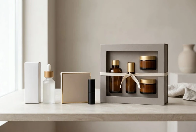
Beauty packaging should protect the product, communicate what it is and make the range recognisable before a shopper tries it. The strongest direction is rarely the most elaborate box: it is a packaging system that fits the product format, sales channel, brand position and future SKU plan.
For brands developing skincare, makeup or gift collections in South Africa, packaging directions that help beauty products stand out before they are even tested usually combine a clear hierarchy of information, considered tactile details and a consistent range architecture. Start with the product’s practical needs, then apply finishes and embellishments where they reinforce the intended value perception.
Packaging requirements for serums, creams, masks, palettes and daily skincare ranges
Different cosmetic products place different demands on their outer packaging. A box for a small serum bottle should prevent movement; a palette carton should guard against corner damage; and a daily skincare range should help customers distinguish products quickly at a glance.
Before selecting a format, define the primary pack dimensions, closure type, fragility, weight and whether the item will be sold alone or as part of a routine.
| Product type | Primary packaging considerations | Useful outer-packaging direction |
|---|---|---|
| Serums and facial oils | Glass bottles, pipettes and droppers may move or break if poorly supported | Folding carton with a fitted insert, or a rigid box for premium presentation |
| Creams and balms | Jars can be heavy relative to their size and may have wide lids | Sturdy carton with enough board strength and a close-fitting internal support where needed |
| Sheet masks and sachets | Flat packs need shelf visibility and easy range identification | Slim cartons, sleeves or multi-pack boxes with clear variant naming |
| Palettes and pressed powder | Corners, hinges and internal pans can be vulnerable to impact | Snug carton, protective insert or rigid set-up box for higher-value formats |
| Lip products | Small units can be easily mixed up across shades | Compact cartons paired with shade labels or colour-coded stickers |
| Cleansers, toners and body care | Bottles may be tall, wide or prone to leakage if closures are compromised | Cartons sized to reduce movement, with practical orientation and handling information |
| Daily skincare routines | Multiple products must be easy to identify in order of use | A coordinated system using product numbers, colour bands or routine icons |
Match the fit to the product, not only the visual concept
An oversized carton can make a product look under-filled and creates room for it to shift. A carton that is too tight may be difficult to pack consistently or may scuff the primary container. Request a physical sample or prototype where possible, particularly for glass, pumps, dropper bottles and multi-piece kits.
For products with an insert, confirm:
- The item can be placed into the insert without forcing it.
- The product does not rattle when the closed pack is handled.
- Pumps, lids, droppers and applicators have adequate clearance.
- The carton closes cleanly without bowing.
- The chosen insert material suits the product’s weight and presentation needs.
- Any contact, migration or recycling requirements applicable to the target market are checked with the relevant product and packaging specialists.
Build a clear information hierarchy
Cosmetic cartons often need to carry product names, usage details, ingredient information, warnings, net contents and brand identifiers. The exact requirements should be verified for the product category and intended market. From a design perspective, prioritise information in this order:
- Brand and product family.
- Product type and main purpose.
- Variant, shade, fragrance or skin concern.
- Size or quantity.
- Supporting directions and required pack information.
This hierarchy is particularly helpful in a bathroom cabinet, retail shelf or online unboxing video, where customers should be able to tell a cleanser from a moisturiser or a day product from a night product without reading every panel.
Box formats that suit fragile, premium or gift-ready beauty products
The right box style reflects both handling needs and the experience the brand wants to create. A basic folding carton may be appropriate for an everyday lip balm, while a launch kit containing several skincare products may justify a more structured presentation.
Folding cartons for efficient single-product packs
Folding cartons are versatile for bottles, tubes, jars, compacts and makeup items. They can be supplied flat for storage and assembled when required. Their suitability depends on board selection, product weight, pack dimensions and whether internal retention is needed.
They work well when the goal is:
- Clear shelf presentation for an individual SKU.
- A light, compact package for an everyday product.
- Printed product education on several panels.
- Consistent branding across a broad range.
For a product that needs more protection, add a purpose-designed insert rather than assuming a heavier-looking carton will prevent movement on its own.
Rigid boxes for premium launches and elevated sets
Rigid or set-up boxes offer a more substantial opening experience and are often considered for high-value cosmetics, discovery sets and gifting. Lid-and-base boxes, magnetic-close styles and drawer boxes can all create an intentional reveal, but they also require more attention to dimensions, inserts and assembly.
Choose a rigid format when the product presentation itself is part of the proposition. Avoid selecting it simply because it appears premium: if the item is a low-cost repeat purchase, a complex box can feel disproportionate and may add unnecessary material.
Sleeves, mailer-style boxes and cartons with windows
Sleeves can turn a standard inner carton or tin into a seasonal edition without redesigning the entire pack. They are useful for limited-run fragrances, festive sleeves and retailer-specific bundles.
Window cartons can show a palette, lipstick colour or gift-set contents before purchase. However, a window should serve a clear purpose. It can reduce printable space, reveal inconsistencies in product placement and make an otherwise protective carton less robust. Confirm that the window material, aperture size and placement are appropriate for the pack’s handling conditions.
For projects requiring a broad choice of formats, explore custom cosmetic boxes with the primary packaging dimensions and intended use defined from the outset.
Surface finishes that influence perceived value in cosmetic packaging
Surface finishes influence how a beauty product is interpreted before the carton is opened. They can make a minimalist skincare line feel clinical and clean, a makeup range feel expressive, or a gift set feel more occasion-led. The most effective approach is restraint: select one or two treatments that support the brand idea rather than adding every available feature.
| Finish or treatment | Visual or tactile effect | Best used for | Watch-outs |
|---|---|---|---|
| Matte coating | Soft, understated and contemporary | Skincare, natural-looking ranges, premium basics | Can show marks on darker colours depending on use and handling |
| Gloss coating | Bright colour and reflective appearance | Youthful makeup, bold graphics, graphic-led collections | May clash with a muted or understated positioning |
| Soft-touch finish | Velvety tactile feel | Premium serums, fragrance-adjacent lines, presentation boxes | Confirm suitability for the expected handling and storage environment |
| Foil detailing | Metallic highlights and strong contrast | Logos, product names, limited editions | Fine artwork and small text need careful review |
| Embossing or debossing | Raised or recessed texture | Brand marks, simple patterns, premium gift packs | Works best with uncomplicated artwork and sufficient space |
| Spot gloss or spot varnish | Localised shine against a contrasting background | Highlights, water motifs, typography or logos | Small details may not produce a clear visual result |
| Uncoated-looking stock | Natural, tactile paper character | Botanical, artisan or minimalist concepts | Confirm print reproduction and protection needs before approval |
A finish cannot rescue unclear artwork or a confusing pack structure. First ensure legibility, correct dielines, well-defined colour use and accurate product information. Then use finishing details to guide attention to the logo, collection name or product benefit.
Keep functional details readable
Fine foil text, low-contrast type and heavy textures can make essential information harder to read. This is a common issue on ingredient panels, directions and shade names. Keep required and practical information in a simple, sufficiently sized typeface, with adequate contrast against its background.
It is also worth reviewing physical samples under different lighting conditions. A shade label that is clear in a studio may be difficult to read in a store, at home or in a photographed online listing.
Gift-packaging opportunities for new collections, festive sets and launch campaigns
Gift packaging allows brands to increase the perceived completeness of a collection. It can also make product discovery easier by grouping complementary products into a ready-made routine, rather than asking customers to select each item independently.
Suitable moments include:
- A first launch of a skincare ritual.
- A discovery selection of miniatures or sample sizes.
- A festive or celebration-focused bundle.
- A new fragrance or shade collection.
- A retailer-exclusive presentation set.
- A thank-you or event pack.
- A limited-edition collaboration or campaign.
Design sets around a coherent use case
A beauty set is more persuasive when it answers a clear need. For example, a simple morning routine, travel selection, complexion pairing or self-care gift has a recognisable purpose. Randomly combining unrelated items may create a larger box without creating a more useful offer.
Consider including a printed card, product order guide or small insert only where it genuinely improves the recipient’s experience. The box should still make sense if the card is removed or discarded.
Plan seasonal packs without disrupting the core range
A sleeve, wrap, lid label or dedicated outer gift carton can distinguish a seasonal offering while preserving the core product packs underneath. This makes it easier to retain a stable brand system and allows individual items to remain saleable after the campaign.
For a collection designed around presentation, custom gift packaging can be considered alongside the product arrangement, opening sequence and insert requirements. Confirm whether the final set will be packed manually or through a defined packing process before settling on a complicated structure.
Sticker options for shades, fragrances, batch variation and rapid SKU growth
Stickers and labels give beauty businesses flexibility when a range has many shades, fragrances, batches or short-run variations. They are especially useful when the core carton artwork remains consistent but individual products need distinct identifiers.
Common uses include:
- Shade names and shade numbers for lip, eye and complexion products.
- Fragrance identifiers for body care, candles or bath products.
- Product batch or production-reference fields, where applicable.
- Limited-edition call-outs.
- Language or market-specific information, where required and verified.
- Temporary bundles or promotional over-stickers.
- Barcode or internal stock-control labels.
Use labels as part of the system, not as an afterthought
A sticker should have a designated area in the carton design. Leaving no space for it can result in labels covering key artwork, directions or product information. Specify the maximum label dimensions, placement, material, adhesive behaviour and data format before finalising artwork.
For colour cosmetics, pair written shade names with a swatch or clear colour cue where appropriate. Printed colour is an aid, not a guaranteed representation of the applied result; lighting, screen settings and substrate variation can influence how it appears.
A well-planned custom sticker solution can help manage SKU growth without creating a new carton layout for every small variant. Check how the labels perform on the chosen carton coating and whether they can be applied cleanly at the intended stage of packing.
Retail packaging versus direct-to-consumer packaging in contemporary beauty sales
Retail and direct-to-consumer (DTC) beauty packs often have different priorities. A retail carton must earn attention among competing products and make key details easy to scan. A DTC shipment needs to reach the customer with the product secure and the brand experience intact.
The same cosmetic carton can sometimes work for both channels, but it should not be assumed to provide all the protection required for dispatch.
| Consideration | Retail-focused pack | DTC-focused pack |
|---|---|---|
| Main role | Attract attention and explain the product quickly | Protect the order and create a coherent unboxing experience |
| Visual emphasis | Front-facing recognition, variant clarity and shelf consistency | Brand continuity from delivery box to product carton |
| Protection | Suitable for normal store handling and display | Often needs additional transit protection around the product pack |
| Information | Product identity, use, variant and practical details | May include order-specific inserts or routine guidance |
| Packaging layers | Usually product carton first | Product carton plus outer shipment packaging and void control where needed |
| Range presentation | Must remain clear when grouped with similar SKUs | Can support cross-sell, bundles and repeat-order messaging |
For DTC orders, assess the full packaging journey: product in primary pack, primary pack in cosmetic carton, carton in shipping packaging, then handling during transport. Fragile items should be evaluated as a packed system. Do not rely on a decorative gift box alone as a transit pack unless its suitability has been specifically confirmed for that purpose.
For retail, carry out a practical shelf review. Place mock-ups next to similar products and ask:
- Is the product category understandable within a few seconds?
- Can shoppers identify the shade, scent or skin concern?
- Are the brand and product names visible from a normal viewing distance?
- Does the range look related without making every SKU look identical?
- Can staff identify and replenish variants without confusion?
Common packaging mistakes in private-label beauty programmes
Private-label beauty programmes can move quickly, but packaging decisions made too early can create costly artwork changes or operational complications later. The following mistakes are common and avoidable.
Designing before primary-pack dimensions are confirmed
A carton should be based on final or verified container dimensions, including caps, pumps and protruding components. Working from an assumed size can result in a poor fit when the actual product arrives.
Treating every SKU as a separate brand
Different products need distinction, but they should still read as one collection. If each scent, shade or skincare concern uses unrelated typography, colours and layouts, the range becomes difficult to shop and harder to expand.
Create fixed elements such as logo position, type hierarchy, icon style and information-panel placement. Then vary a controlled feature, such as a colour band, product number or shade label.
Adding too much copy to small cartons
Small makeup and skincare cartons have limited usable space. Crowding every panel with marketing claims, icons and decorative elements can reduce clarity. Prioritise the information customers need and verify what product information must appear on the pack for the intended market.
Ignoring the packing process
An attractive box can be difficult to assemble, fill or close consistently. Consider who will pack it, how products will be oriented, whether labels are applied before or after packing, and how set components will be kept in place.
Selecting a finish without testing the artwork
Very dark solid areas, extremely fine reverse text, low-contrast designs and detailed foil features need careful proofing. Review supplied artwork specifications and physical proofs where available before committing to a full production run.
Forgetting future range extensions
A design that only works for one jar size or one product name can become restrictive quickly. Establish rules for longer names, new sizes, bilingual or additional content needs, shade families and gift-set versions before launch.
How to create a cosmetic packaging system that can expand with the range
A scalable packaging system gives a beauty brand room to introduce new products without losing recognition or rebuilding every artwork file. The aim is not to make every carton identical; it is to create a repeatable framework.
1. Define the brand constants
Choose the elements that should remain stable across the range:
- Logo placement and minimum clear space.
- Core typography.
- Main brand colour or neutral base.
- Product-name hierarchy.
- Illustration, icon or pattern style.
- Position of mandatory and practical information.
These constants build recognition whether the customer sees a small lip carton or a large gift box.
2. Establish a variation method
Use a limited, logical method to distinguish categories and variants. A skincare range may use colour blocks by routine step, while makeup may use shade families and finish descriptors. The method should still work when the collection grows from five products to 30.
Useful variation tools include:
- Colour bands or coloured end panels.
- Numbered routines.
- Category icons.
- Product-family names.
- Stickers for shades or fragrances.
- A common layout with flexible product-name space.
3. Create a format matrix
List current and expected products by primary-pack size, weight, fragility and box type. This reveals where shared carton structures are possible and where a dedicated solution is necessary.
For example, several dropper bottles may share one carton footprint if their finished dimensions are genuinely compatible, while a wide cream jar and a tall pump bottle are likely to require separate structures.
4. Set artwork rules before the first print run
Document colour references, bleed areas, barcode placement, label zones, text sizes and panel priorities. This helps internal teams, agencies and suppliers work from the same expectations when a new SKU is added.
5. Review the complete customer journey
Assess the package in the context in which it will be used: on shelf, in a product photograph, in a delivery box, in a gift bag and in the customer’s home. A successful system remains legible and recognisable at each point.
FAQ
Should every cosmetic product have its own box size?
Not necessarily. Shared carton sizes can simplify a range when primary packs have compatible dimensions and sufficient protection. Do not force different containers into one size if it leaves excess space, creates a poor fit or compromises presentation.
Are rigid boxes necessary for premium cosmetics?
No. Premium perception can come from proportion, clean design, quality print execution and carefully chosen finishes. Rigid boxes are most appropriate when the product price point, gifting role or presentation experience justifies the added structure.
What is the easiest way to manage many makeup shades?
Use a stable main carton design and allocate a clearly visible zone for shade identification. Combine a written name or number with a colour cue where useful, and keep the placement consistent across the whole shade range.
How can a skincare range look cohesive without becoming repetitive?
Keep core brand elements consistent, then vary one or two controlled elements by category or routine step. This lets customers identify products quickly while maintaining a unified look.
The practical next step is to list each product’s final dimensions, sales channel, variant requirements and intended customer experience. With that information, you can compare box structures, inserts, finishes and labels against the needs of the complete range rather than choosing packaging one SKU at a time.
