
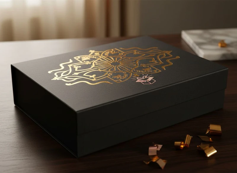
A well-chosen finish can turn an ordinary custom paper box into packaging that looks considered, feels distinctive and protects the printed surface in handling. The best option is not necessarily the most decorative one: it is the finish that supports your brand aesthetic, suits the box material and print design, and remains practical for the way the product will be packed, displayed and used.
When planning beyond the box: innovative finishes for custom paper box design, start with the desired customer impression. A restrained cosmetic carton may benefit from soft-touch lamination and a small foil detail, while a gift box may call for embossing, richer colour and a more prominent metallic element. Build the finish around the purpose of the pack rather than treating it as a final add-on.
The Luxurious Effect of Hot Foil Stamping
Hot foil stamping applies a thin metallic or coloured foil to selected areas of a printed box using heat and pressure. Gold and silver are familiar choices, but foil is also available in a range of tones and effects, including copper-like shades, coloured foils and less reflective finishes.
It is particularly effective for small, intentional details such as:
- A logo or monogram
- Product names or limited-edition text
- Borders, line work and icons
- Decorative patterns on presentation boxes
- Short statements on a lid or front panel
Foil catches light differently from printed ink, so it can create a noticeable point of contrast without covering the whole design. On dark uncoated-looking boards, deep colours or soft-touch laminated surfaces, a fine foil element can make a box feel more premium and deliberate.
Design considerations for foil
Foil stamping is strongest when the artwork is simple and has enough clear space around it. Very small type, tightly packed fine lines and intricate patterns may not reproduce consistently, particularly on textured stocks or box surfaces with folds and seams. Keep foil away from creases, glue flaps and areas likely to receive frequent abrasion.
The final effect also depends on the base surface. Highly reflective foil over a glossy laminate creates a bold, high-shine look; the same foil on a matt surface is often more refined. Request a physical sample or proof where possible, especially when matching foil to other packaging components.
When foil may not be the right choice
Foil is not always necessary for a premium result. Large areas of foil can dominate the artwork, show marks in handling, and add complexity to the production process. For designs that need a metallic hint over broad areas, metallic ink may be a more appropriate option. If the key aim is texture rather than shine, embossing or debossing may better serve the concept.
Spot UV Coating for Texture and Contrast
Spot UV is a clear, glossy coating applied only to selected parts of a printed design. It is often used over a matt background to create contrast between a smooth, reflective area and a more subdued surface.
Common applications include:
- Logos and brand marks
- Product photography or illustrated features
- Patterned backgrounds
- Key words, names or numbers
- Fine details on beauty, technology or promotional packaging
Although Spot UV is clear, it can make a printed colour appear deeper and more visually prominent. The effect is most visible when light moves across the box, which gives a flat printed surface a more layered appearance.
Use contrast, not coverage
Spot UV is usually most effective as a controlled accent. Applying it to every visible panel can reduce the contrast that makes it appealing in the first place. A matt laminate with a glossy logo, for example, offers a clear visual hierarchy. A full glossy box with Spot UV may produce a subtler result.
There are practical limitations to consider. Fine Spot UV details require clean, well-prepared artwork. Registration between the printed image and the coated area should be checked, especially where the coating follows thin text or precise image edges. Heavy coverage can also make scuffing or fingerprints more apparent, depending on the substrate and handling conditions.
For tactile contrast, pair Spot UV with a matt or soft-touch laminated base. For visual contrast alone, it can also work effectively over selected coloured areas on a standard coated board.
Embossing and Debossing for Tactile Appeal
Embossing raises an element above the surrounding surface, while debossing presses it below the surface. Both processes add physical dimension to paper box packaging and give customers something to feel as well as see.
Embossing and debossing work well for:
- Brand logos
- Initials, seals and crests
- Minimal line art
- Product names on gift boxes
- Repeating tactile patterns
- Subtle borders or frame details
These finishes are especially valuable when a brand identity relies on craftsmanship, simplicity or understated quality. A blind emboss, made without ink or foil, can be an elegant choice for a monochrome box. Embossing combined with foil can make a logo more prominent, though the design should allow adequate space for both effects.
Choose board and artwork carefully
The quality of a raised or recessed result depends on the board thickness, surface structure, artwork detail and box construction. A heavier or more rigid board is generally more suited to visible dimensional effects than a very thin stock. However, the intended box style, folding requirements and product weight all influence what can be specified.
Avoid placing embossed details over fold lines, close to cut edges or on areas that will be tightly wrapped, glued or repeatedly flexed. Deep impressions can alter the reverse side of the board, which matters if the interior will be visible.
Small type and elaborate artwork may lose clarity. It is better to simplify the artwork and make a tactile detail confidently readable than to use a complex mark that is difficult to reproduce.
Metallic Inks: When to Use Them for Packaging
Metallic inks contain reflective pigments that create a metallic appearance when printed. Unlike foil, metallic ink is applied as ink and can therefore be useful for larger graphic areas, gradients, illustrations and multi-element designs.
Use metallic ink when you want to:
- Print larger metallic blocks or backgrounds
- Add a subtle shimmer rather than a mirror-like foil effect
- Include metallic tones within illustrations
- Maintain a more continuous printed appearance
- Create a coordinated colour palette across several box panels
Metallic inks can look polished and sophisticated, but they do not generally have the sharp reflectivity of hot foil stamping. They are best viewed as a print effect rather than a direct replacement for foil.
| Finish | Best visual effect | Suitable design use | Points to check |
|---|---|---|---|
| Hot foil stamping | Bright, reflective highlights | Logos, short text, borders and small decorative elements | Fine detail, placement near folds, foil colour |
| Metallic ink | Softer metallic sheen | Larger areas, illustrations, patterns and backgrounds | Appearance on chosen board, colour consistency, coating compatibility |
| Spot UV | Clear gloss and contrast | Selected logos, images, words and patterns | Alignment, fingerprint visibility, base laminate |
| Embossing or debossing | Raised or recessed texture | Simple logos, symbols and tactile accents | Board thickness, reverse-side effect, fold placement |
Metallic ink and colour expectations
Metallic inks are influenced by the base material, surrounding colours, lighting and any protective coating placed over them. A metallic shade may appear more muted on one board than another. Where a precise brand colour is important, discuss the intended substrate and finishing sequence before approving final artwork.
A protective coating can be useful, but it may also change the level of shine. Consider the complete surface specification rather than selecting the ink in isolation.
Lamination Choices: Soft Touch vs. Anti-Scratch
Lamination adds a film layer over the printed box surface. It can improve the perceived finish and give the print added protection during routine handling. Two options often considered for premium paper boxes are soft-touch lamination and anti-scratch lamination.
Soft-touch lamination has a velvety, smooth feel and a low-sheen appearance. It is commonly chosen for premium cosmetics, electronics, apparel accessories and presentation packaging where the tactile experience matters.
Anti-scratch lamination is designed for projects where maintaining a neat outer appearance during packing, display and handling is a priority. It is often considered for dark-coloured boxes, which can make surface marks more visible.
Soft touch versus anti-scratch at a glance
| Consideration | Soft-touch lamination | Anti-scratch lamination |
|---|---|---|
| Main impression | Velvety, refined and matt | Clean, durable-looking surface |
| Best for | Tactile premium packaging | Boxes likely to receive regular handling |
| Visual character | Low sheen, often understated | Usually matt or low gloss, depending on specification |
| Potential concern | Can show fingerprints or marks on some colours | Feel and appearance vary by material option |
| Useful pairing | Spot UV, foil or embossing | Simple print, foil or selected varnish details |
Neither choice is universally better. A dark, soft-touch gift box can look striking, but it should be assessed with the intended artwork because marks may be more noticeable on certain colours. An anti-scratch option may be the more practical choice for a box that will move through several handling stages before reaching the customer.
Confirm whether the laminate is suitable for the planned post-press finishes. Foil, Spot UV, embossing and gluing can each require particular preparation or production sequencing.
The Paper Box Finish That Matches Your Brand Aesthetic
A finish should reinforce the brand rather than compete with it. Before selecting effects, decide what the packaging should communicate in the customer’s hands: warmth, technical precision, natural simplicity, celebration, heritage, playfulness or quiet luxury.
Here is a practical way to connect finish choices to common brand directions:
- Minimal and premium: matt or soft-touch lamination, blind embossing, and one restrained foil detail.
- Bold and contemporary: vivid print colours, Spot UV graphics, metallic ink accents or a glossy feature panel.
- Natural and craft-led: uncoated or textured-looking board, limited print coverage, debossing or a subtle varnish. Confirm whether the chosen finish changes the desired natural feel.
- Elegant and celebratory: foil stamping, embossed logos, rich printed colour and structured gift-box construction.
- Modern technology-focused: clean graphics, anti-scratch lamination, controlled Spot UV and metallic ink used sparingly.
- Youthful or playful: bright colour blocking, graphic varnish patterns and tactile details that remain easy to read.
Start with the product journey
The product category matters, but the handling journey is equally important. Ask these questions before finalising a finish:
- Will the box be handled frequently before purchase?
- Is it intended for shelf display, online orders, gifting or all three?
- Will the packaging be photographed under bright lighting?
- Does the box need to coordinate with labels, inserts or outer shipping packaging?
- Which panel should carry the strongest visual detail?
- Are there folds, seams or glue areas that restrict a finish?
- Does the finish support the intended recycling or material objectives? Confirm the full material construction with your supplier.
For products that require specific labelling, safety information or market-related packaging obligations, verify the applicable requirements for the product and target market. Decorative finishes should never reduce the clarity or legibility of required information.
For a broader starting point on formats and structures, review the available custom box options before deciding where a finish will have the most impact.
Custom Varnish and Protective Coatings
Varnishes and coatings can protect printed paper boxes while also changing their appearance. They may be applied across the full surface or to selected areas, depending on the desired effect and the requirements of the box.
Typical options include:
- Gloss varnish: adds shine and can make colours appear more vivid.
- Matt varnish: reduces shine for a softer, more muted appearance.
- Satin varnish: sits between gloss and matt for a balanced finish.
- Spot varnish: highlights selected design elements.
- Protective coatings: selected to help the box cope with normal production, packing and handling conditions.
The right coating depends on the board, ink coverage, box use and additional finishes. For example, a full gloss varnish may suit bright retail graphics, while a matt coating may provide a more restrained base for a foil logo.
Avoid assuming that “protective” means indestructible
No finish removes the need for sensible packaging design, handling and storage. Friction, sharp contact points, moisture exposure, heavy stacking and repeated opening can all affect the appearance of paper-based packaging. Discuss the likely handling conditions and request appropriate samples before committing to a large production run.
Also check how the coating interacts with glued areas, barcodes, writing surfaces and labels. If a label will be applied after box production, test its adhesion on the finished surface. Product identification can be coordinated with custom printed stickers where a separate label is the practical choice.
Showcasing Premium Design on Gift Packaging
Gift packaging gives finishes an especially important role because the box itself becomes part of the presentation. The opening experience, texture and visual detail can influence how considered the product feels before it is even used.
A premium gift box does not need every available effect. Often, two well-matched finishes are more effective than several competing ones. Consider combinations such as:
- Soft-touch lamination with a small gold or silver foil logo
- Matt laminated board with a raised embossed pattern
- Deep-coloured print with Spot UV artwork
- Textured board with blind debossed branding
- Metallic ink illustration with a satin protective coating
The construction should guide the finish placement. A focal detail on the lid can create a strong first impression, while a subtle interior message or pattern can add interest after opening. Avoid placing critical branding where ribbon, sleeves, closures or inserts will obscure it.
For presentation-led projects, explore custom gift packaging alongside the finish specification. The box style, opening method and insert design should work together with the surface treatment.
A practical specification checklist
Before approving artwork for a finished paper box, document:
- Box dimensions, style and board choice
- Printed colours and artwork files
- Lamination, varnish or coating type
- Areas for foil, embossing, debossing or Spot UV
- The order in which finishes should be applied
- Location of folds, cut lines, glue areas and barcode panels
- Intended packing, display and handling conditions
- A physical or digital proof process to confirm
This avoids a common mistake: approving an attractive flat design without checking how it will sit across panels, corners and folds once converted into a box.
The most effective finish is one that makes the design clearer, more tactile or better suited to the product journey. If you are comparing options for a new packaging project, prepare a short brief with your box structure, artwork, preferred surface feel and handling needs. XGolden Print can then help translate those choices into a practical custom packaging specification; learn more about XGolden Print.
