
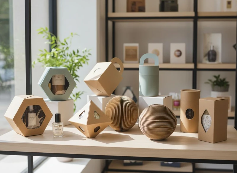
The best paper packaging does more than contain a product: it makes the product easier to notice, understand, protect and remember. These 10 creative paper box ideas to elevate your product presentation can be adapted for retail shelves, corporate gifts, online orders and limited-edition ranges.
Start with the product’s size, weight, fragility and retail environment. Then select one or two high-impact design features rather than combining every possible finish, shape and insert. A clear idea, executed consistently, usually creates a stronger result than an over-designed box.
- Use a distinctive structural shape.
- Add a tactile matte, gloss or textured finish.
- Reveal the product with a die-cut window.
- Make one-colour printing work harder.
- Use colour intentionally to guide attention.
- Build in a fitted insert for protection and presentation.
- Create a layered opening sequence.
- Turn the inside of the lid into a brand touchpoint.
- Design a reusable box where it suits the product.
- Create a practical design specification before ordering.
Maximising Shelf Appeal with Unique Box Shapes
An unusual box shape can make a product more recognisable before a customer reads the label. The goal is not novelty for its own sake; it is to choose a structure that suits the product, supports handling and creates a clear visual silhouette.
Useful shape-led options include:
- Sleeve-and-tray boxes: A printed outer sleeve slides over a tray. This creates a deliberate reveal and gives brands separate areas for product information and visual storytelling.
- Pillow boxes: Curved ends give compact items such as accessories, small gifts or confectionery a softer, gift-ready appearance. Check that the product fits securely, as the curved structure may reduce usable internal volume.
- Hexagonal or triangular cartons: These can distinguish a product range on display, particularly for lightweight products. They require careful dimensioning so they stack and store sensibly.
- Gable boxes: A built-in handle can suit takeaway-style gifting, promotional packs or items that need to be carried easily. Confirm that the handle and board strength are appropriate for the packed weight.
- Book-style rigid boxes: A hinged lid gives a more considered opening experience for premium gifts, cosmetics, stationery and presentation sets.
- Display-ready cartons: A perforated or removable panel can turn the outer packaging into a counter or shelf display. The tear line must be tested on a physical sample to ensure it opens neatly.
Before committing to an irregular shape, check its practical effects. Non-standard structures can create more offcuts during production, take up more storage space or need specialised packing methods. Ask for a plain structural sample to check product fit, opening action, stacking and shelf presence before approving printed artwork.
For products needing a more conventional outer carton, a well-proportioned rectangular box can still look distinctive through colour blocking, panel layouts and a strong opening feature. Explore suitable structures through custom box packaging options.
Shape selection checklist
Choose a shape only after confirming:
- The product can be inserted and removed without damage.
- The box closes securely during handling.
- Important product information has enough flat, readable space.
- The structure can be packed, stored and displayed efficiently.
- The design accommodates any labels, barcodes or variable information required for your sales channel.
- Material and construction are suitable for the product’s weight and intended use.
Incorporating Texture and Finishes (Matte/Gloss)
Surface finish changes how a paper box looks in the hand and under shop lighting. It can also separate parts of the design without adding more colours or graphics.
A matte finish has a low-shine appearance that can feel restrained, contemporary and premium. It works well with muted palettes, fine typography and product photography. Matte surfaces can show scuffs or fingerprints differently depending on the material and colour, so inspect a sample in the environment where the box will be handled.
A gloss finish reflects more light and can make bright colours, images and bold graphics appear more energetic. It can be useful for youthful, high-contrast or image-led packaging. However, glare can affect readability, particularly on small type or detailed product instructions.
Other options worth considering include:
- Spot gloss or spot varnish: Applies shine to selected elements, such as a logo, pattern or illustration, while the rest stays matte.
- Embossing and debossing: Raises or recesses selected details for a tactile effect. Fine detail needs to be checked carefully on the chosen board.
- Foil accents: Can add contrast to a name, border or small brand mark. Use sparingly so the focal point remains clear.
- Uncoated or textured paper: Offers a natural, tactile character and may suit artisanal, stationery or gift-led products. Printing results and durability can differ from coated stock.
- Soft-touch coatings: Create a velvety feel, but suitability depends on handling, storage and the expected product life cycle.
A common mistake is choosing a finish only from a swatch. View a printed proof or production-style sample because ink coverage, board texture, lighting and large areas of dark colour can change the final impression.
Die-Cutting and Window Patches: A Closer Look
Die-cutting allows a box to include cut-out shapes, tabs, handles, apertures and decorative edges. A window patch adds a transparent film behind an opening, allowing customers to see the product while keeping it enclosed.
A window is most useful when the product’s appearance helps sell it. It can work well for colourful gift sets, baked goods, cosmetics, craft products, apparel accessories or items with a distinctive texture. A small, well-positioned window often performs better than a large opening because it keeps more room for messaging and structural strength.
Consider these window approaches:
| Window approach | Best suited to | Key consideration |
|---|---|---|
| Small logo-shaped aperture | Branded gifts and compact products | Keep fine details simple enough to cut cleanly |
| Front-panel product window | Products where colour or form matters | Protect the product from scratches and movement |
| Die-cut reveal without film | Secondary packaging or protected items | Consider dust exposure and product security |
| Side or top viewing strip | Bottles, tubes or vertically packed products | Ensure the opening does not weaken the panel |
| Full-panel window patch | Gift sets and visual product assortments | Can reduce printable space and alter material choices |
Windows should be designed around the product’s actual resting position. If the item can shift inside the box, the window may reveal an empty area rather than the product. A fitted insert, divider or folded inner support can keep the display consistent.
Avoid placing windows across fold lines, too close to corners or in areas that carry the box’s main load. The final structural decision should be verified with the packaging supplier, particularly for heavier products or boxes that will be stacked.
Cost-Effective Custom Packaging Strategies
Creative packaging does not have to mean adding every premium feature. The most cost-effective custom box is one that prioritises the details customers will see and use while avoiding complexity that does not improve the experience.
Make a standard structure feel custom
A standard tuck-end carton or mailer-style box can become distinctive through thoughtful graphic design. Consider a bold single colour, an illustrated inside panel, a branded seal or a carefully placed product message before moving to an entirely bespoke structure.
This approach can reduce development complexity while still giving the packaging a recognisable identity.
Limit the number of decorative processes
Combining metallic foil, embossing, multiple coatings, intricate die-cuts and an elaborate insert can make a box visually busy and more complex to produce. Select one hero feature. For example:
- Use a matte box with one small foil logo.
- Use a simple carton with an illustrated interior.
- Use a clean window and a single-colour outer design.
- Use a textured board with minimal printing.
Design to the product, not around empty space
Oversized packaging can use more material than necessary and allow products to move during transport or handling. Measure the product, any protective wrapping and the desired clearance before determining internal dimensions.
Request dimensions in a clear format and establish whether they refer to internal or external measurements. This avoids a common procurement issue: a box that looks correct on a drawing but is too tight once inserts and product tolerances are included.
Plan artwork for flexibility
If a range has several flavours, colours or variants, build a consistent design system. Keep the main brand elements fixed and vary a defined area, such as a colour band, product name or illustration. This helps products look related while making each variant easier to identify.
When comparing quotes or specifications, confirm what is included: board type, printing colours, finishes, die-cutting, inserts, assembly requirements, proofing and minimum order quantities. Commercial terms can vary significantly, so written specifications are more reliable than assumptions.
The Role of Colour Psychology in Box Design
Colour helps customers form a quick impression, but it should support your product positioning rather than rely on universal assumptions. Cultural context, category conventions, lighting and individual preferences all influence how colour is received.
Use colour in three practical ways:
- Create hierarchy. Make the brand, product type and variant easy to find in that order. If everything is bright or large, nothing stands out.
- Support category recognition. Certain product categories use familiar visual cues. You can follow those cues for clarity or deliberately depart from them when differentiation matters more.
- Improve navigation. Colour coding can help customers distinguish product variants, sizes, scents, flavours or collections.
For example, a wellness product may use calm, spacious colour palettes, while a festive gift range may use stronger contrast and metallic accents. Neither approach is automatically right. The important question is whether the colour supports the intended product perception and remains legible.
Colour checks before approval
- Check contrast between text and background, especially for small copy.
- Review colours under natural and indoor retail lighting where possible.
- Avoid relying on colour alone to distinguish variants; add names, icons or other clear identifiers.
- Ensure barcodes, mandatory information and batch details remain readable.
- Confirm that brand colour expectations are realistic for the selected printing method and board.
- Review physical proofs when colour matching is especially important.
Designing the Perfect Box Interior (Inserts)
The inside of the box is where presentation and protection meet. An insert can stop a product from moving, create space between items, guide the customer through a set or turn a simple box into a more considered reveal.
Common insert types include:
- Folded card inserts: Suitable for lightweight items and often integrated neatly into the pack design.
- Die-cut card trays: Hold products in defined positions and can create a clean, structured presentation.
- Dividers: Separate multiple items, such as gift sets, jars, bottles or samples.
- Paper wraps and belly bands: Add a layer of presentation without requiring a full tray.
- Layered inserts: Reveal products in stages, useful for kits and multi-item sets.
An insert should fit the product’s actual shape and tolerance, not just its nominal dimensions. A product can vary slightly because of caps, labels, seams, protective wrapping or manual assembly. Build in appropriate clearance, then test how the product behaves when the box is opened, tilted and carried.
For fragile or unusually shaped items, do not assume a decorative paper insert provides sufficient protection. Consider the full journey from packing through to customer handling, and verify the material and structure against the real product.
The inside is also valuable communication space. A short welcome message, instructions, care note or product story can be printed under the lid or on an insert. Keep it purposeful: the customer should be able to find the product and understand the next action immediately.
Unboxing Experience: Making Your Gift Packaging Memorable
Gift packaging benefits from a sense of sequence. A customer should not have to tear, force or shake the box open to reach the product. The best unboxing experience is clear, easy and aligned with the value of the item.
A practical unboxing sequence may include:
- An outer box that protects the contents and introduces the brand.
- A sleeve, seal or closure that signals where to open.
- A lid, tray or flap that reveals a printed message or design detail.
- An insert that holds the product in place.
- A final small element, such as a care card, note or tissue wrap, where it adds useful context.
For gift boxes, consider whether the recipient may reuse the packaging. A sturdy box with a neutral yet branded design can have a second life for keepsakes, desk storage or gifting. Reuse should never compromise the primary needs of product protection, accurate information and straightforward opening.
Avoid adding layers simply to make the box feel more expensive. Excess components can frustrate customers and complicate packing. Each element should have a job: protect, organise, inform, reveal or reinforce the brand.
For packaging intended specifically for gifting, review custom gift packaging ideas alongside the product’s dimensions and intended presentation.
Ways to evaluate creative paper box design
A creative concept should be evaluated as a working package, not only as a digital mock-up. Use the following scorecard when comparing options from a designer, packaging buyer or supplier.
| Evaluation area | Questions to ask |
|---|---|
| Product fit | Does the product fit consistently with its wrap, label and accessories? |
| Protection | Will the structure and insert control movement during ordinary handling? |
| Shelf impact | Can a customer identify the brand and product quickly from the front and side panels? |
| Opening experience | Is it obvious where to open, and can the product be removed without damage? |
| Information layout | Is essential copy readable, logically placed and free of clutter? |
| Production practicality | Are the structure, finishes and artwork suitable for the intended quantity and budget? |
| Consistency | Will the design work across different variants, sizes or seasonal editions? |
| End-of-use considerations | Are materials, separable components and disposal information appropriate for the intended market? |
Common creative packaging mistakes
- Choosing a box shape before measuring the product and insert.
- Using too many finishes, colours or messages on one small pack.
- Putting fine type, barcodes or critical details across folds and seams.
- Creating a window that does not align with the product once packed.
- Forgetting to allow for labels, seals, protective wrapping or product tolerances.
- Treating a digital render as proof that the structure will work.
- Making environmental or material claims without verifying them for the relevant materials and target market.
- Failing to check applicable packaging, labelling and product requirements for the category in which the product will be sold.
Frequently asked questions
What is the most versatile creative paper box idea?
A printed sleeve-and-tray combination is highly versatile because it can work for gifts, retail products and sets. The sleeve provides a strong branding area, while the tray can be adapted with an insert to suit the product.
Should I choose matte or gloss packaging?
Choose matte when you want a softer, lower-shine presentation and gloss when you want brighter visual impact. The right option depends on your artwork, handling conditions and product category. Comparing physical samples is the safest way to decide.
Do window boxes protect products adequately?
A window can be compatible with product protection, but the strength of the box depends on the window size, location, patch material, board and insert design. Test the complete assembled pack rather than judging the window in isolation.
How can a small range look consistent without identical boxes?
Use a fixed design system: consistent logo placement, typography, layout and box structure, with controlled changes to colour, product names or illustrations. This keeps variants recognisable while helping customers tell them apart.
What should be included in a packaging brief?
Include product dimensions and weight, photographs or samples, internal and external box dimensions, intended sales channel, desired quantity, artwork requirements, finish preferences, insert needs, packing method and any information that must appear on the pack. Also identify which details are essential and which are optional.
A strong paper box concept balances creativity with fit, clarity and practical production. Begin by choosing the one feature that best expresses your product—shape, texture, a reveal or a fitted interior—then build the remaining details around it. For support translating a packaging concept into a workable specification, learn more about XGolden Print and its custom packaging experience.
